Education through intertwined print and interactive media.
YOUR FORBES
In response to the ever-evolving digital landscape that exists nowadays, Forbes tasked us to design the future of their online experience with the goal of bringing new users to the site, as well as increasing retention of existing users.
DETAILS
Designer
12 Weeks
9 Designers
PURPOSE |
In the digital age we live in, customers are used to having relevant news at their fingertips.
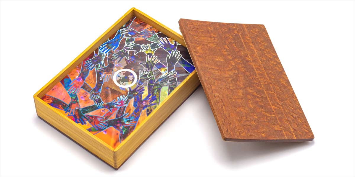
Intertwining print and interactive experiences to educate students about relationships and habitats in nature.
For elementary school teachers, it can be difficult to make the assigned curriculum interesting and engaging for their class. I an eight other designers teamed up to create a matching card game that teaches about symbiotic relationships, teamwork, accepting help, and so much more.
PROJECT GOALS
Education through imagination
Strike the balance between a childs imagination and the
education they are partaking in.
Provide the building blocks
While keeping the game as simple as possible, provide enough context for teachers to immediately jump into the topic.
Reinforce existing topics
Because the curriculum is already defined for teachers, the game and experiences should fit into existing required topics.
RESEARCH + STRUCTURE
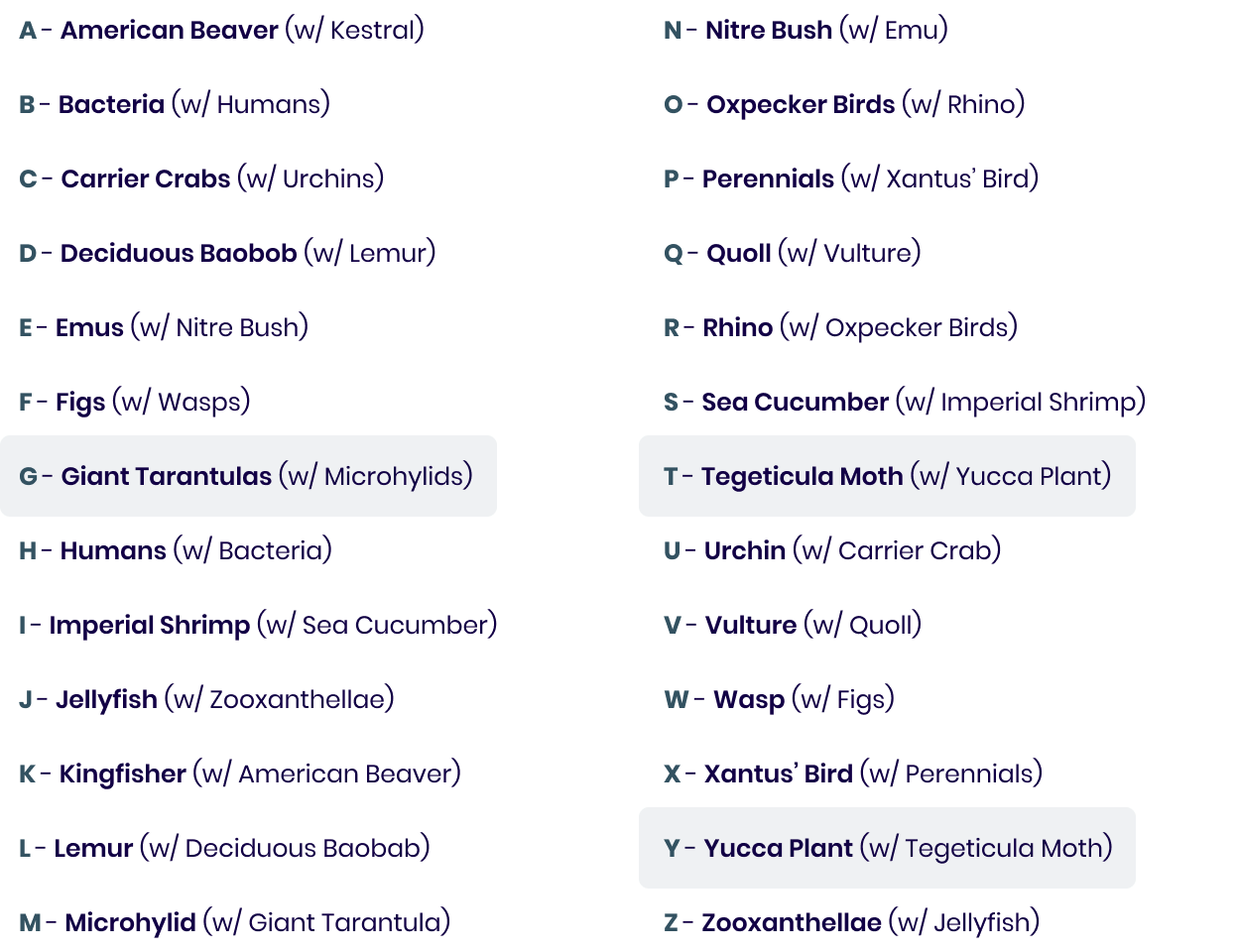
Identifying existing symbiotic relationships to create our pairings.
Identifying existing symbiotic relationships to create our pairings.
We started by finding existing symbiotic relationships in nature, focusing in on how each animal helps one another and how we could translate that into an illustrative result. My letters for the project were G, T, and Y.
A large part of our research process was devoted to identifying existing pairings within nature that could cover every letter of the alphabet. Although time-consuming, this was important to create these pairings as they are the pillars of our project. My letters for the project were G, T, and Y.
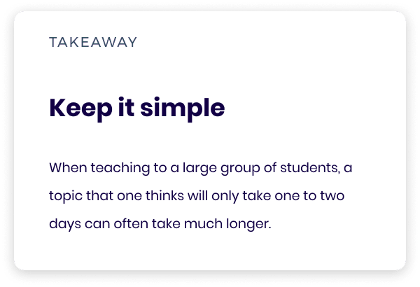
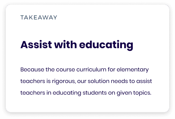
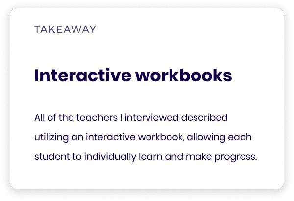
To guide our designs, we interviewed school teachers to gain insight on how they keep their classes engaged with required material. I conducted four of the seven interviews.
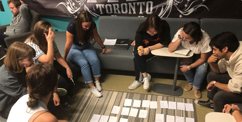
I led a crazy-4’s exercise to help generate ideas and solidify our card design, prompting each designer to produce four separate ideas under a tight time constraint.
This allowed us to quickly produce a myriad of potential solutions before narrowing down and discussing which sketches and concepts stood out most to us.
Because all nine of our group members had different ideas of what the playing cards should look like, I led a rapid ideation exercise in which each designer got four index cards, and was given a single minute to quickly sketch out their idea before moving onto the next card. This exercise allowed us to quickly produce a myriad of potential solutions before narrowing down and discussing which sketches stood out to us.
We utilized an iterative and streamlined group critique based strategy to consistently update our card structures when needed. In addition, we utilized component based templates through Figma to quickly make changes and test drafts of all of our cards.
Because all nine of our group members had different ideas of what the playing cards should look like, I led a rapid ideation exercise in which each designer got four index cards, and was given a single minute to quickly sketch out their idea before moving onto the next card. This exercise allowed us to quickly produce a myriad of potential solutions before narrowing down and discussing which sketches stood out to us.
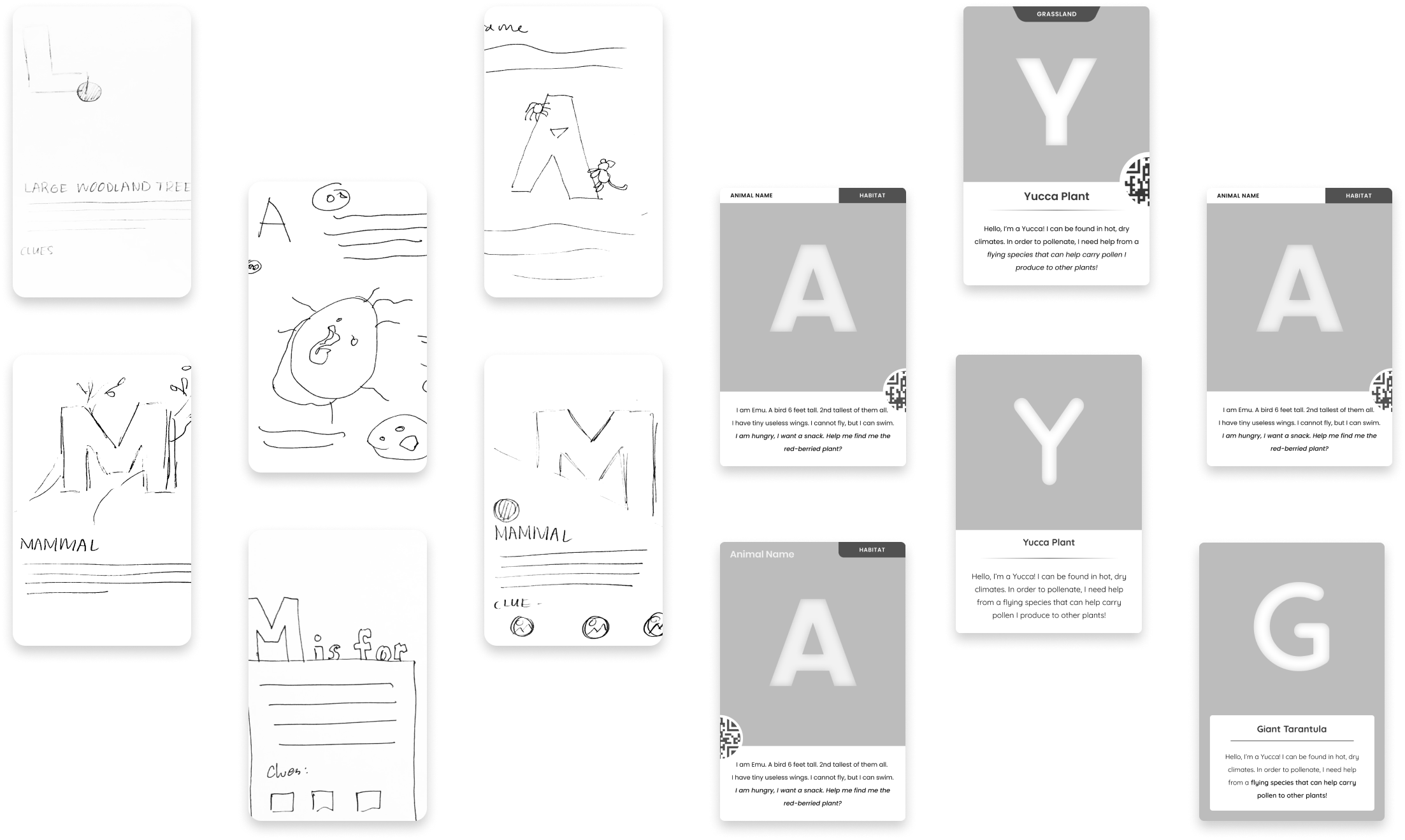
Final Card Wireframe
After establishing a collective group of iterations for our card game, we set to establishing a final template for our cards. As this game is for a young audience, we had to make sure our information was both digestible, as well as well-balanced with the illustration.
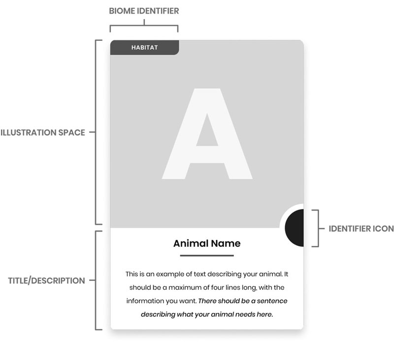
04 ─ SOLUTION
To establish consistency in our cards, our group employed a rapid iteration exercise.
Crafting a unique visual and interactive experience for each one of my assigned cards.
With the structures set up for both our card game as well as our interactive experience containers, we branched out to individually design our card illustrations and our tablet interactions, allowing each group member to put their own mark on the project.
Because all nine of our group members had different ideas of what the playing cards should look like, I led a rapid ideation exercise in which each designer got four index cards, and was given a single minute to quickly sketch out their idea before moving onto the next card. This exercise allowed us to quickly produce a myriad of potential solutions before narrowing down and discussing which sketches stood out to us.
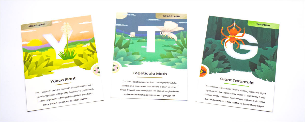
I took careful consideration to allow a player to be satisfied with my playing cards illustrations while still keeping in mind that these would be used for educating young students. My cards are a glimpse into an animal's habitat, engaging a student through depth and exciting visuals.
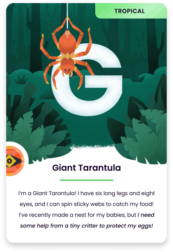
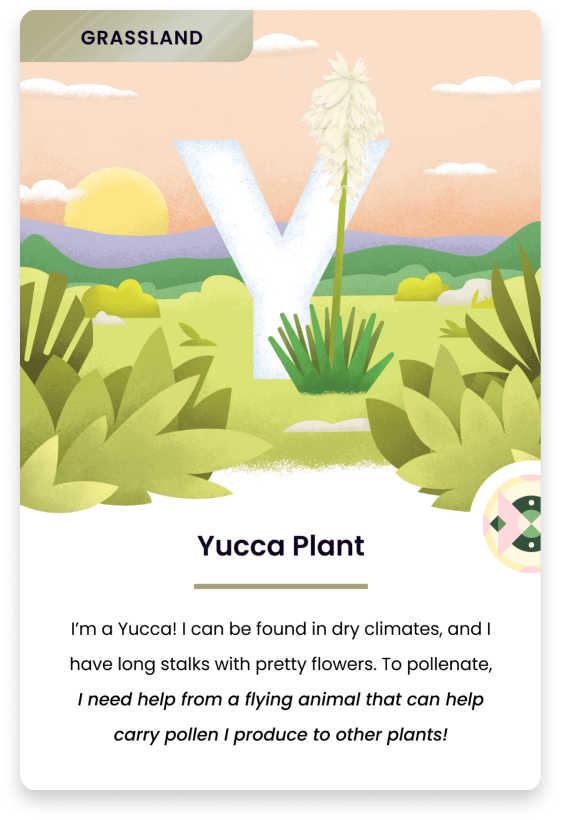
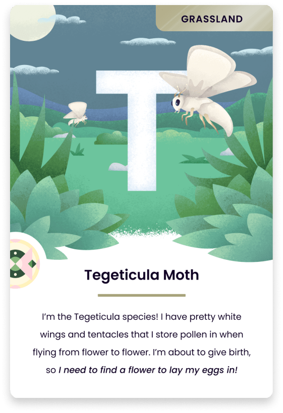
For my interactive experiences, I chose to pursue a form of “digital workbook”. Each interaction is composed of two core parts: a small interactive activity, and then an explorative animation that the student can use to learn more about the habitat their animal comes from.
Giant Tarantula
Tegeticula Moth
Yucca Plant
We recognized the need for a consistent "container" to house our interactive experiences. We leveraged our research about current classroom technology to imagine a tablet experience that allows for easy access to all of our digital card experiences. We set two goals for this container:
Because all nine of our group members had different ideas of what the playing cards should look like, I led a rapid ideation exercise in which each designer got four index cards, and was given a single minute to quickly sketch out their idea before moving onto the next card. This exercise allowed us to quickly produce a myriad of potential solutions before narrowing down and discussing which sketches stood out to us.
Our final container is made to balance the showcasing of our individual experiences while still maintaining a simple navigational structure, with clear points of entry to the additional features of the container.
Because all nine of our group members had different ideas of what the playing cards should look like, I led a rapid ideation exercise in which each designer got four index cards, and was given a single minute to quickly sketch out their idea before moving onto the next card. This exercise allowed us to quickly produce a myriad of potential solutions before narrowing down and discussing which sketches stood out to us.
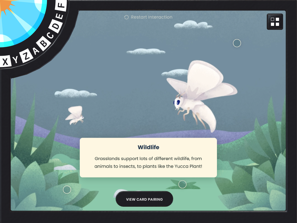
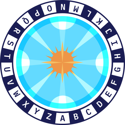
INTERACTIVE COMPONENT
Spinning wheel navigation
To introduce a fun and interesting navigational interaction, we imagined a spinning wheel that allows a student to quickly scroll and find their favorite letter, keeping the exploration of the letters at the forefront.
INTERACTIVE COMPONENT
Educational card pairings
In addition to playing the interactive experience, a student can easily view the cards pairing as well as information on how the two animals interact and help one another exist. This allows for an easy educational opportunity, while keeping the matching component of the print media.
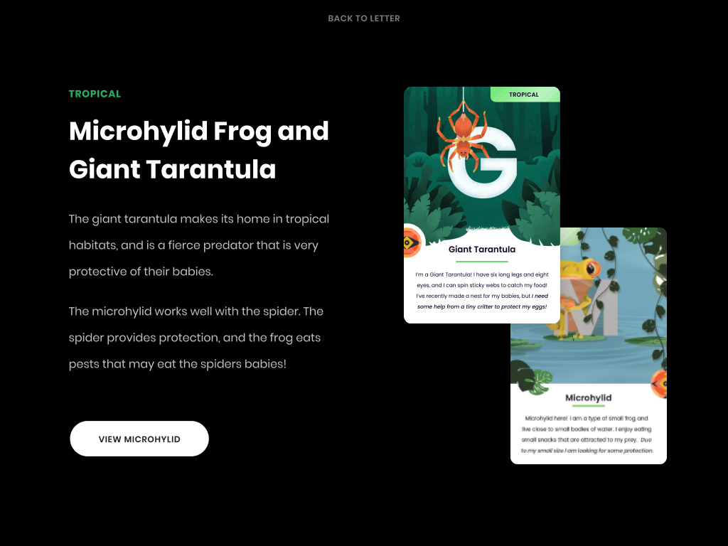
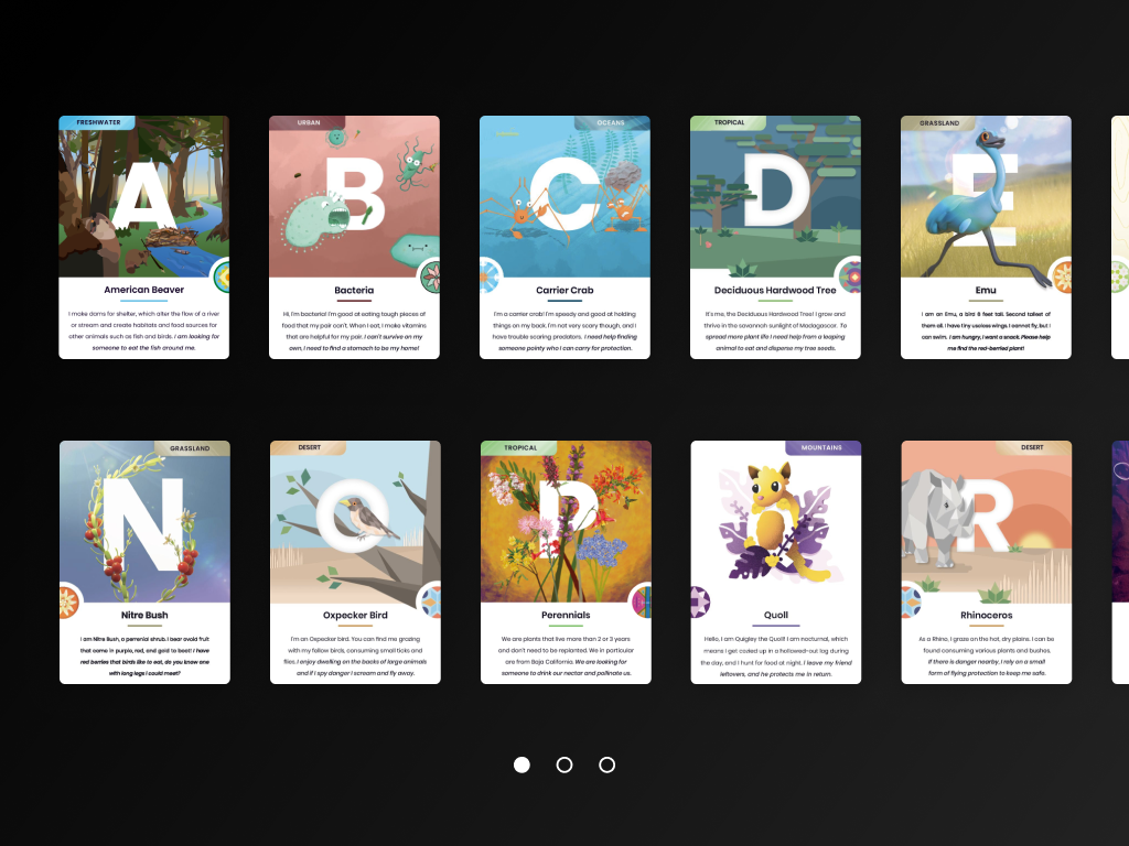
INTERACTIVE COMPONENT
Grid card view
As a secondary form of navigational entry to the cards, we included a grid view that shows a visual of each card, allowing students who may be more visually inclined to exploring the cards to still easily navigate the container.
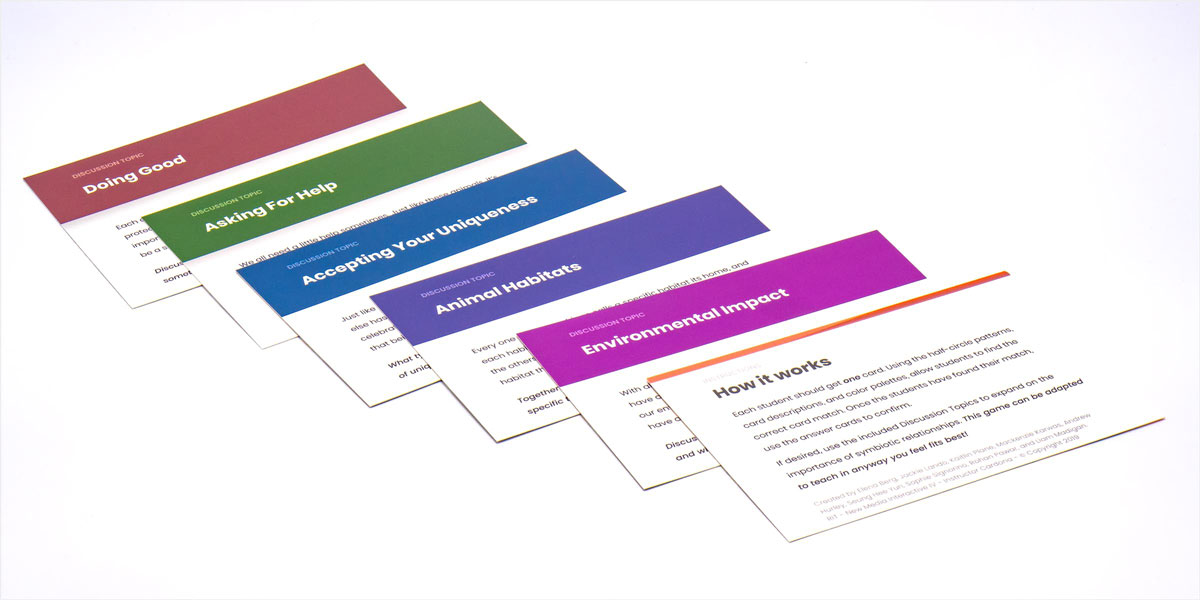
Finally, to increase the versatility of our experience I designed a set of discussion cards that draw upon several core concepts that the game can be used to speak about.
With this, our game is kept flexible enough to allow teachers to utilize it in any way they want, while still having the discussion cards to jump off of.
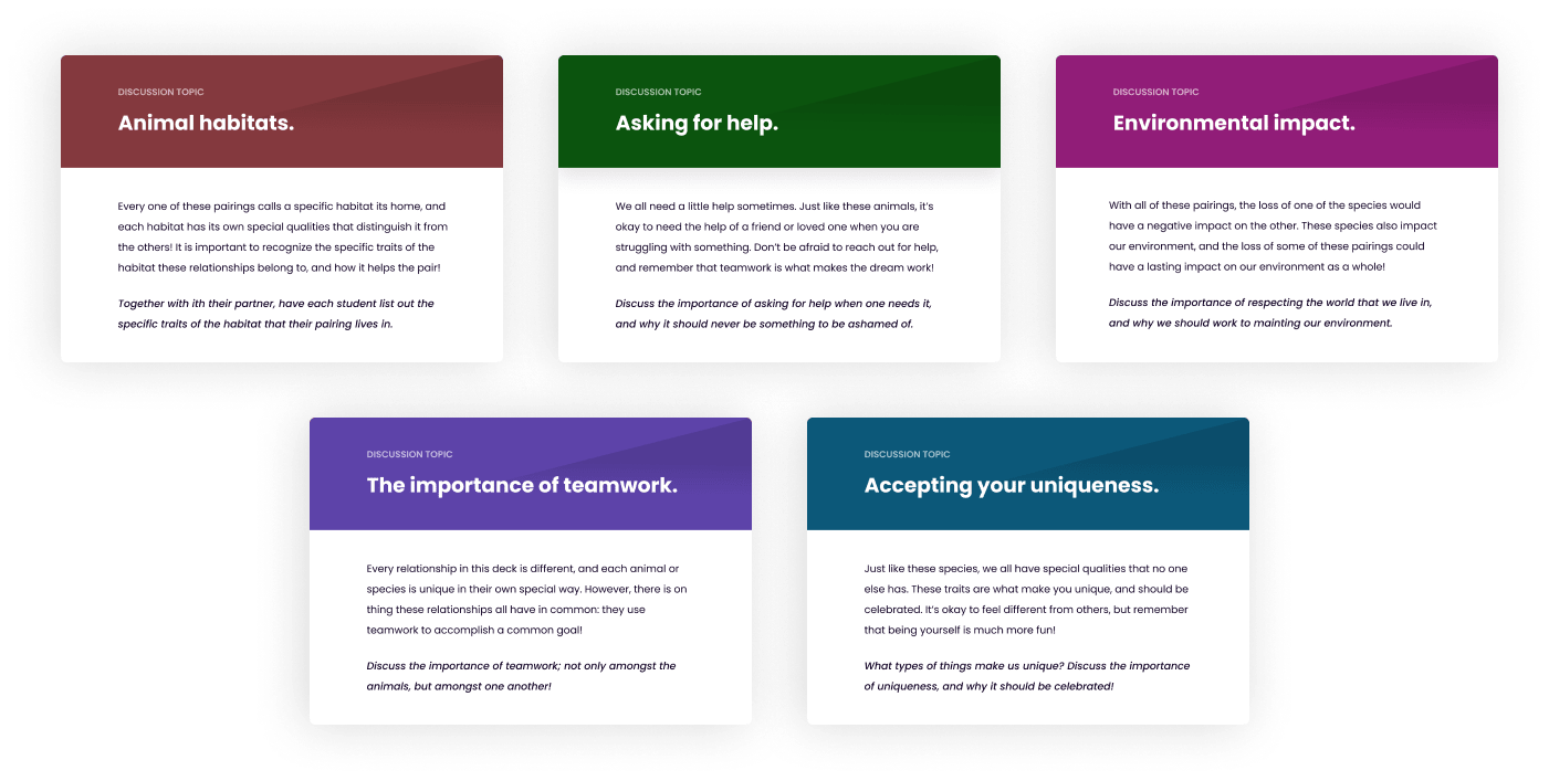
PRINT MEDIA
CONCLUSION
To establish consistency in our cards, our group employed a rapid iteration exercise.
Throughout the process, consistency of communication and collaboration was key- just like the topics our experience was centered around.
From the ground up, our team built a print and interactive experience that was intertwined on several different layers. By utilizing our collaborative skillset and establishing set interaction and design standards, we were able to rapidly prototype and produce a product that was just as interactive as it was fun to use. In the future, we would love to be able to expand this even further through a gamification of the matching card game process, and also be able to offer teachers the prints and cards for free as a means of educational resources!
You can view the rest of the card deck and my groupmates work at this fancy link.
Because all nine of our group members had different ideas of what the playing cards should look like, I led a rapid ideation exercise in which each designer got four index cards, and was given a single minute to quickly sketch out their idea before moving onto the next card. This exercise allowed us to quickly produce a myriad of potential solutions before narrowing down and discussing which sketches stood out to us.
LIAM MADIGAN
CHICAGO, IL
© 2025
LMADIGANDESIGN@GMAIL.COM
