Amount's next generation of point-of-sale solutions
YOUR FORBES
In response to the ever-evolving digital landscape that exists nowadays, Forbes tasked us to design the future of their online experience with the goal of bringing new users to the site, as well as increasing retention of existing users.
DETAILS
Lead Designer
3 Months
1 Designer, 4 Developers, 1 P.O.
PURPOSE |
In the digital age we live in, customers are used to having relevant news at their fingertips.
In response to a booming repayment environment, Amount recognized an opportunity to step into the space with their own point-of-sale solution.
With the growing popularity of buy now pay later services, consumers are increasingly seeking convenient and flexible payment options for their purchases. Amount aimed to help banks rapidly digitize their solutions through a white label Buy Now, Pay Later product.
I lead the design for this endeavor, taking lead on all aspects of the process from competitive analysis to design to user testing. Additionally, I utilized my design thinking, collaboration and leadership skills to disrupt Amount's traditional processes, bringing a fresh, user-first approach.
FEATURES |
Surveying to explore how users are currently consuming their news.
Complete your tasks, your way
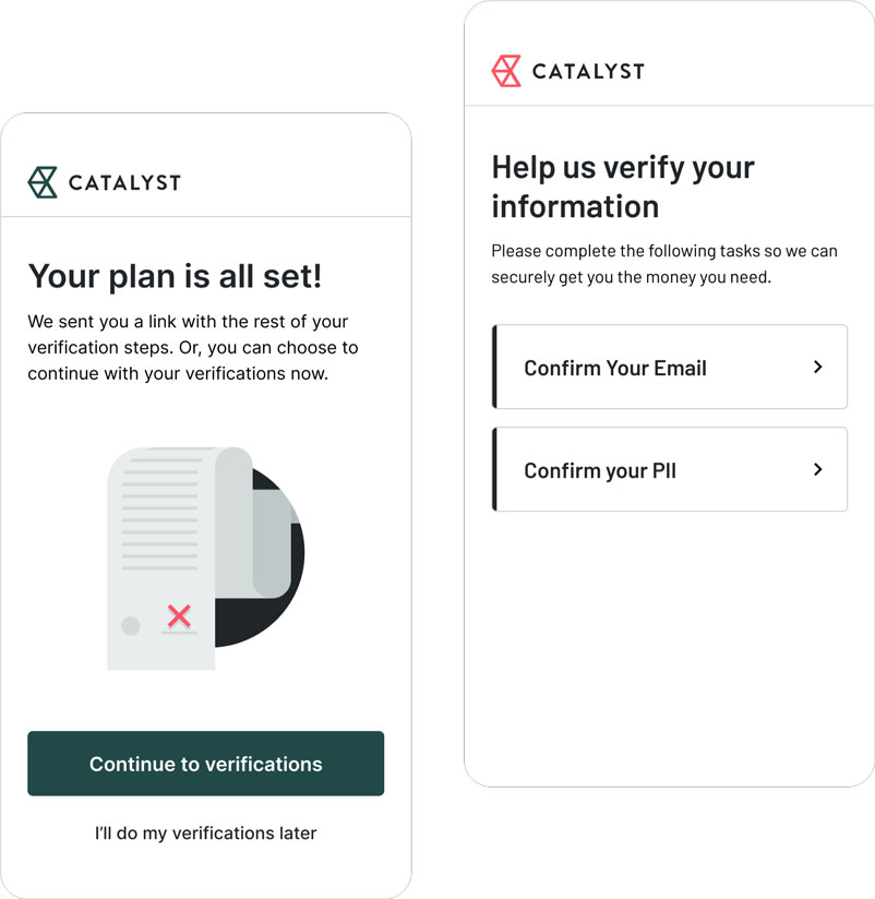
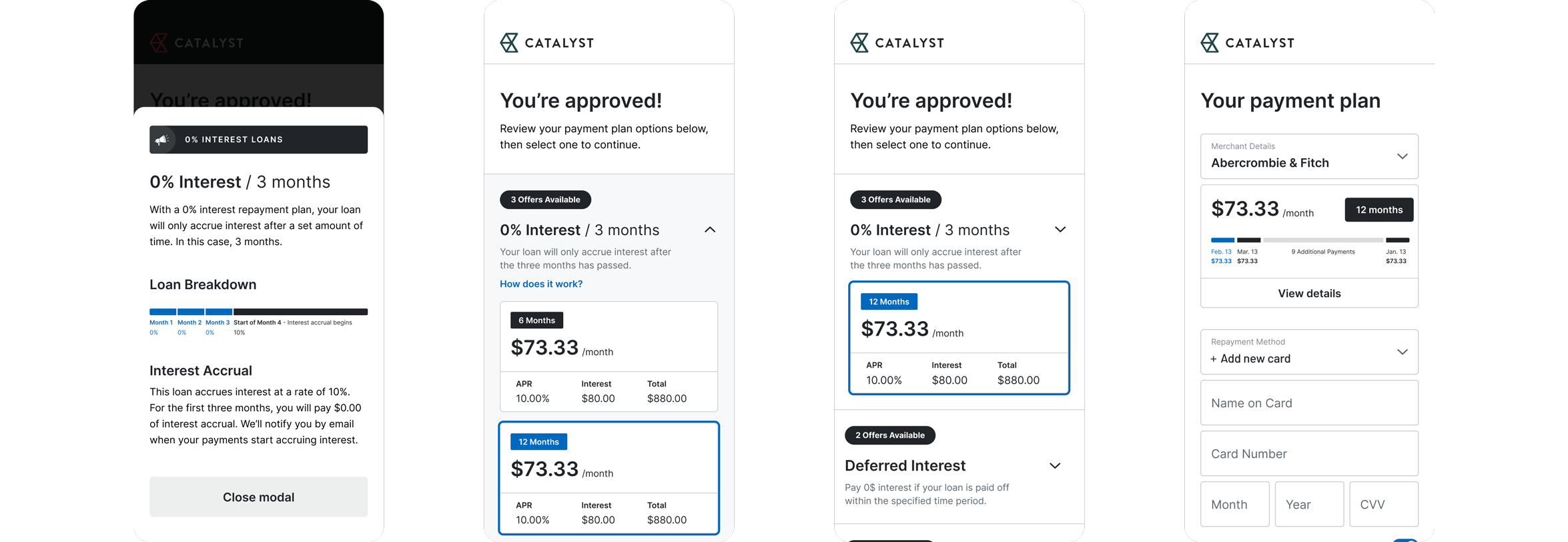
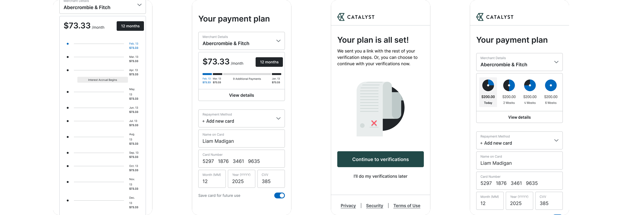
Amount's asynchronous verification process allows users to complete any necessary additional tasks, such as providing additional information or verifying their identity, without disrupting their main goal of splitting up a purchase into manageable payments.
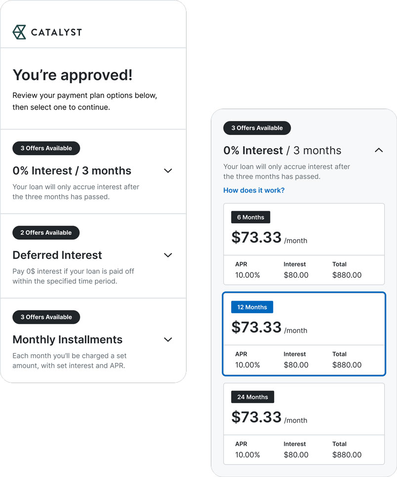
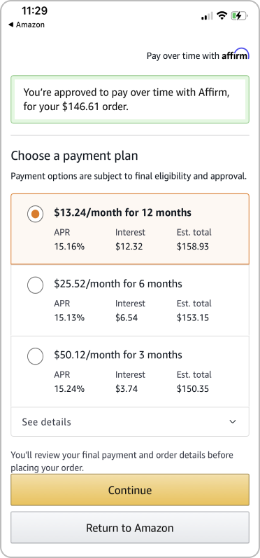
A mixed batch of ways to pay
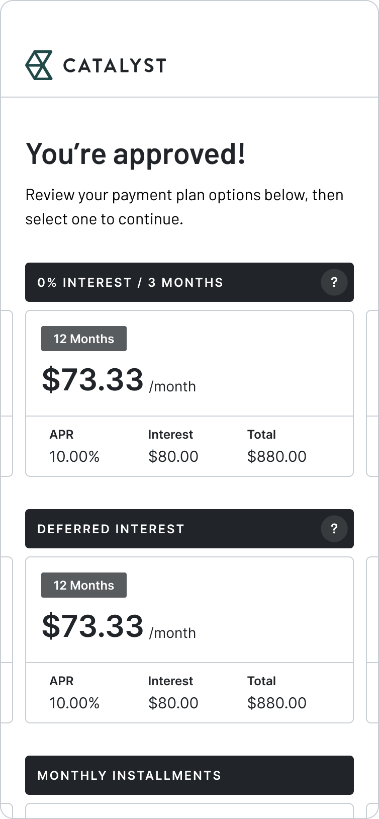
Users have the ability to choose from a wide array of loan options presented in an intuitive and navigable format, granting them maximum flexibility in determining their repayment plan.
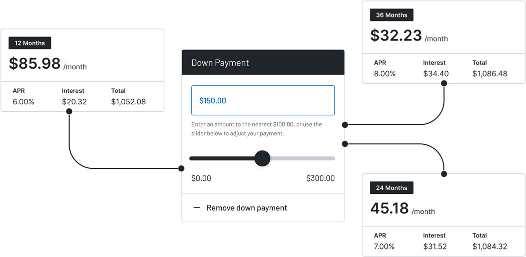
Promoting smarter spending
Our solution allows consumers to make flexible down payments, enabling smarter spending and greater control over their finances with the swipe of a finger.
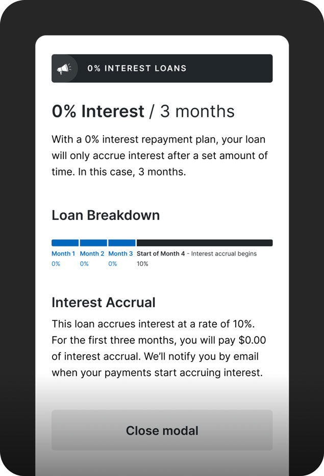
Emphasizing financial literacy
Our product promotes financial literacy by incorporating informative modals that educate users on responsible spending habits and budgeting strategies.
BACKGROUND / OPPORTUNITIES |
Surveying to explore how users are currently consuming their news.
The solution is divided into three distinct sections: verifications, offer selection, and repayment - each presenting its own unique challenges that require innovative solutions.


Verifications
Streamline the process of verifying the customer's identity and financial information, while maintaining the highest level of security and privacy, to ensure a quick and efficient loan approval process.
Offer Selection
Enables users to choose from a variety of loan offers, each tailored to their individual needs and financial situation, ensuring that the customer makes an informed decision from their approved offers.
Repayment
Seamlessly integrate the presentation of a manageable repayment plan combined with efficient loan processing to provide customers with a stress-free and smooth end point to their experience.
Recognizing that communication channels between design and product could be strengthened, I approached this work by utilizing the active integration of design thinking and principles into our processes.
After conducting research about my audience and their experiences with task management, I created three distinct user stories that best encompassed the struggles my users will face.
DESIGN PILLARS
TIER ONE - PERSONALIZATION EFFORTS


Increase Transparency
With collaborative discussions and techniques, improve information flow within our team.
Prioritize Collaboration
Our processes and shaping techniques should accurately reflect the team-based structures.
Test Often
Concrete data from our users should be crucial. Test our designs often for validation.
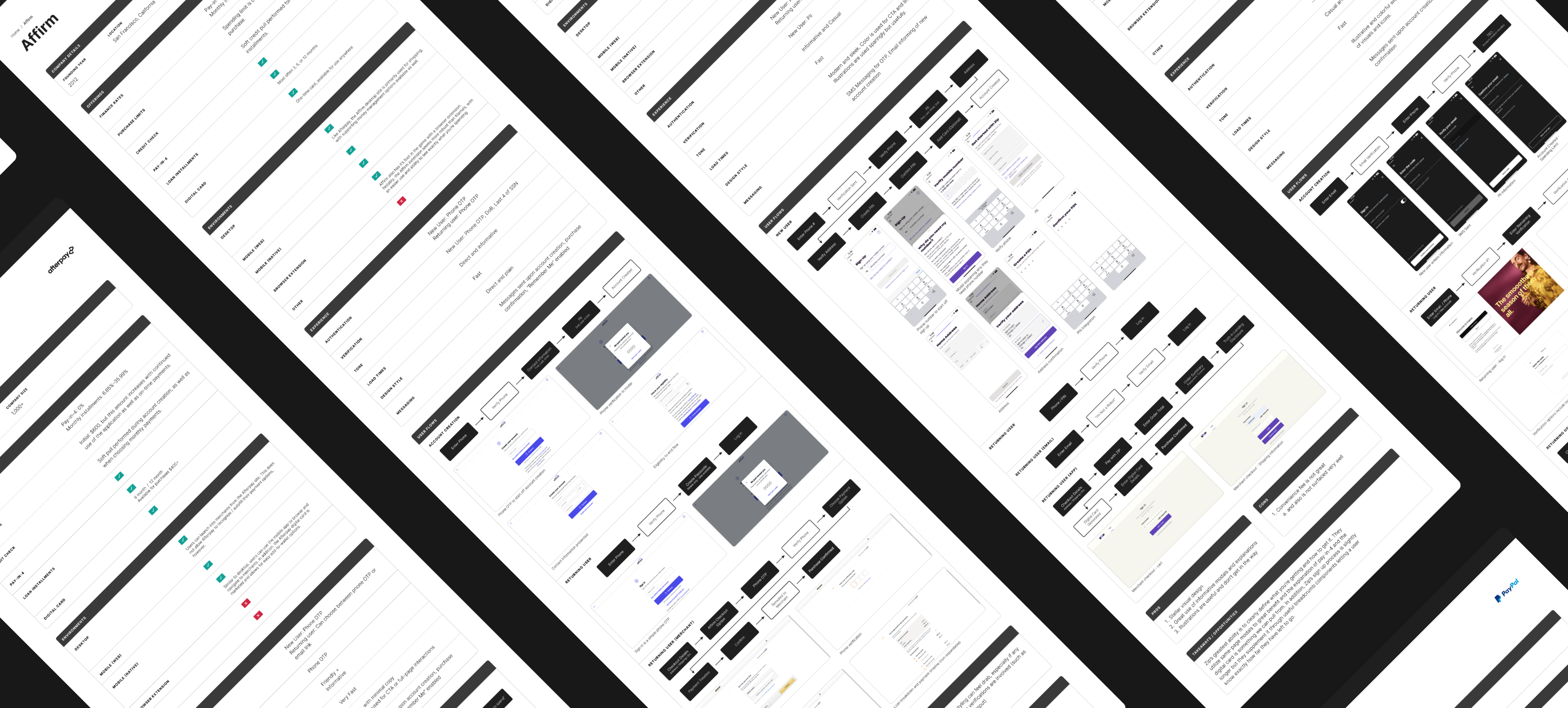
To start our design process, and to assist in guiding our decision-making and solution, I reviewed existing BNPL solutions that existed within the booming environment. As our solution would ultimately be going up against these competitors, it was critical that design pushed for the most up-to-date features and experience as possible. In reviewing existing solutions, I was able to point to specific opportunities to pull into our flow, as well as critical points where our experience could falter if not handled correctly.
After conducting research about my audience and their experiences with task management, I created three distinct user stories that best encompassed the struggles my users will face.
Klarna
- Accessibility
- Myriad of offerings and features
- Satisfying interface and design style
Afterpay
- Easy to use
- Simple workflows
- Easy verification process
- Solid data visualization (for pay-in-4)
Affirm
- Integration and ease-of-use
- Direct and transparent
- Both desktop and mobile application are very well-functioning and allow a user to accomplish their tasks in any environment
To generate tangible documentation as well as improve our processes for future design endeavors, I collapsed these findings into a componentized competitive analysis template and shared it with designers and non-designers alike, allowing for a critical piece of the design process to be easily incorporated into the shaping segments of our cycles.
After conducting research about my audience and their experiences with task management, I created three distinct user stories that best encompassed the struggles my users will face.
VERIFICATIONS |
Surveying to explore how users are currently consuming their news.
How might we...
...make the new user process as simple and concise as possible?
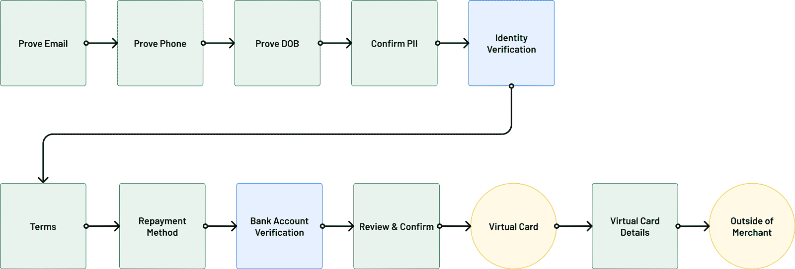
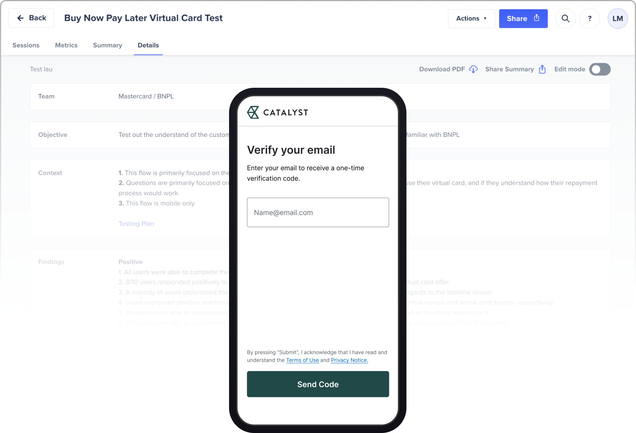
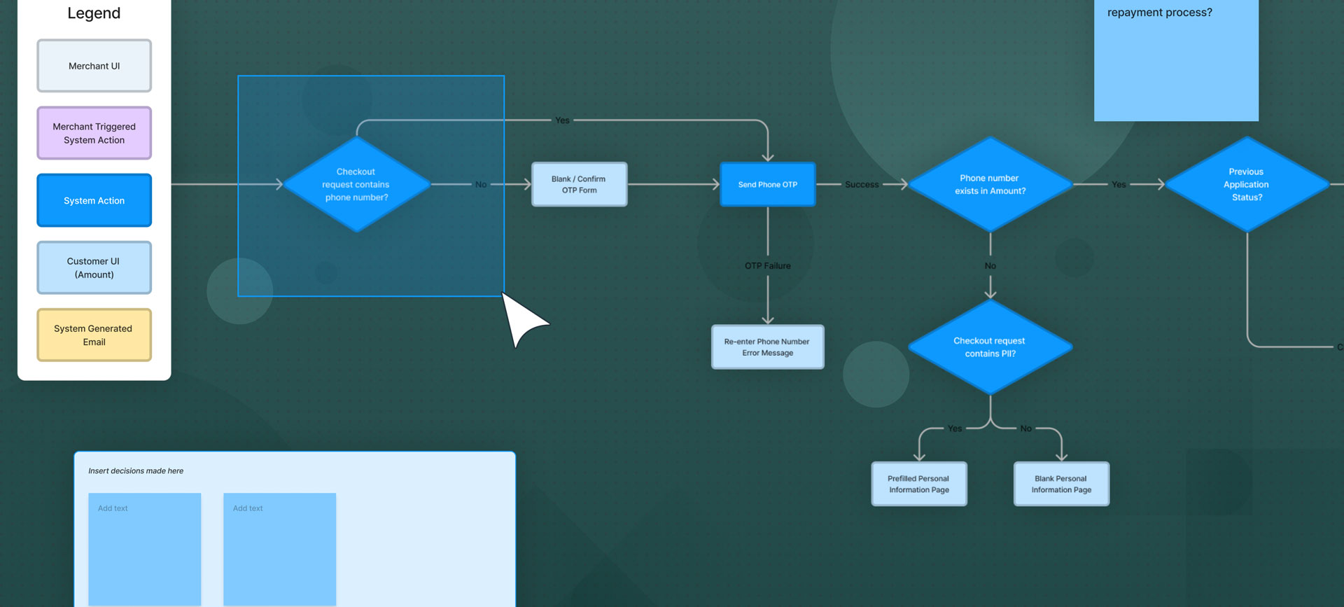
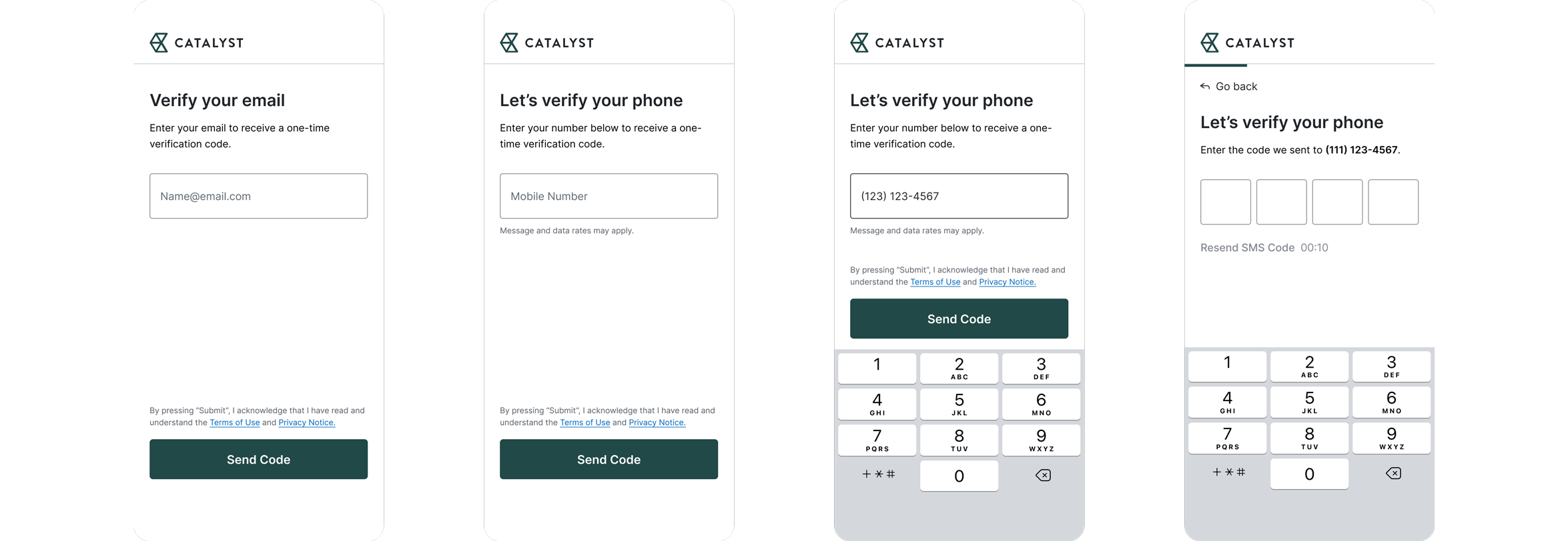
Initially, Amount had aimed to utilize a previous verifications flow from years prior, which would require a large bulk of customer information to be provided upfront. However, after mapping out our initial user flow I quickly recognized a potential pain-point for our users.
From an experience standpoint, forcing our users through an extensive verifications process ran the risk of increasing the likelihood of drop off and reducing retention rate, leading to a harder sell to our financial partners on integrating this software.
After conducting research about my audience and their experiences with task management, I created three distinct user stories that best encompassed the struggles my users will face.
I lead working sessions to draft up our unmoderated testing plan within Google Docs, allowing for easy transparency and discussion as to each group’s needs. I then translated our testing definition sheet into two separate unmoderated testing sessions, allowing for rapid results to be collected for analysis.
We asked probing questions on how users felt about our current flow (using our original user flow), if they felt comfortable using it, and if it felt trustworthy enough to enter sensitive information into.
After conducting research about my audience and their experiences with task management, I created three distinct user stories that best encompassed the struggles my users will face.
Test Overview
After conducting research about my audience and their experiences with task management, I created three distinct user stories that best encompassed the struggles my users will face.
• 10 participants • Unmoderated sessions • Mobile device
After conducting research about my audience and their experiences with task management, I created three distinct user stories that best encompassed the struggles my users will face.
Overall, the flow did not test very well. Users voiced concerns about the process asking for too much of their information and, in general, felt far too long compared to competitor solutions that they had used before.
I synthesized these results and presented them to stakeholders, utilizing the concrete data to emphasize the need for a slight pivot in our approach. With the backing of our team, we shifted our initial flow and utilized two distinct opportunities as solutions:
After conducting research about my audience and their experiences with task management, I created three distinct user stories that best encompassed the struggles my users will face.
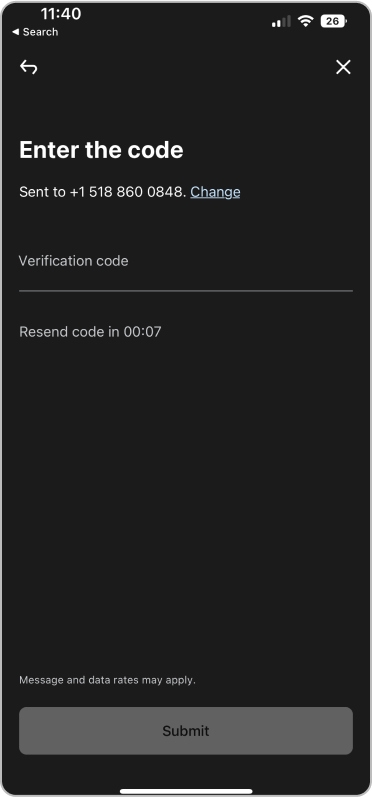
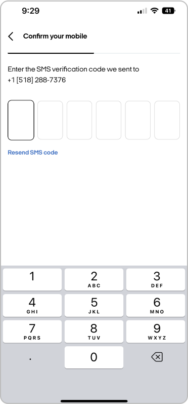
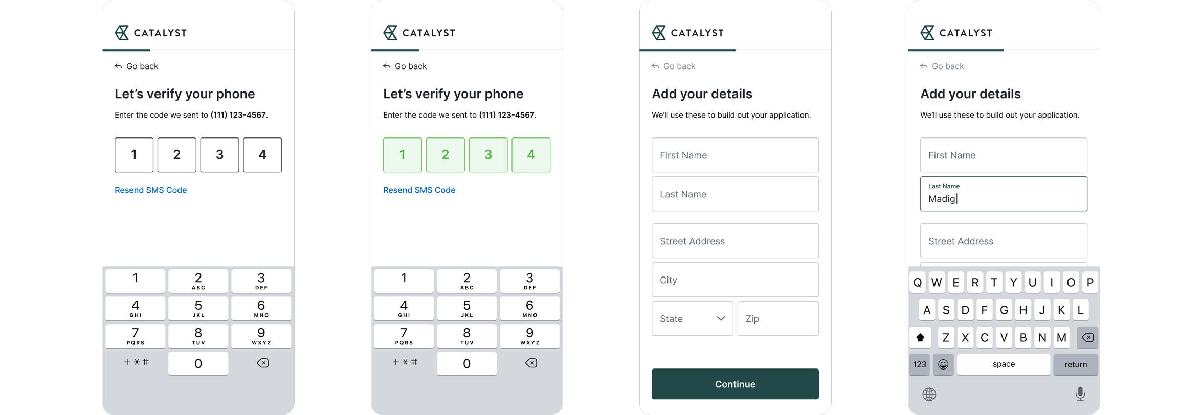
OTP Utilization
By utilizing OTP, we were able to shorten our new user flow while maintaining the same level of authenticity and security by incorporating an extra step of verification, reducing the risk of fraudulent activity and improving the overall user experience.
Asynchronous Verification
With the heavy emphasis on security in our solution, asynchronous verification enabled our users to resume their activity and tasks at any time, providing a much-needed feeling of completion for our users as opposed to a seemingly endless flow of verification tasks.
OFFER SELECTION |
Surveying to explore how users are currently consuming their news.
How might we...
...offer users a variety of options in an easy-to-understand way?
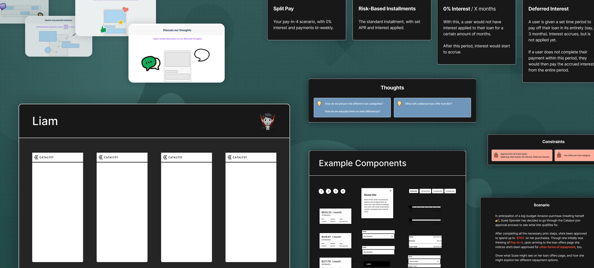
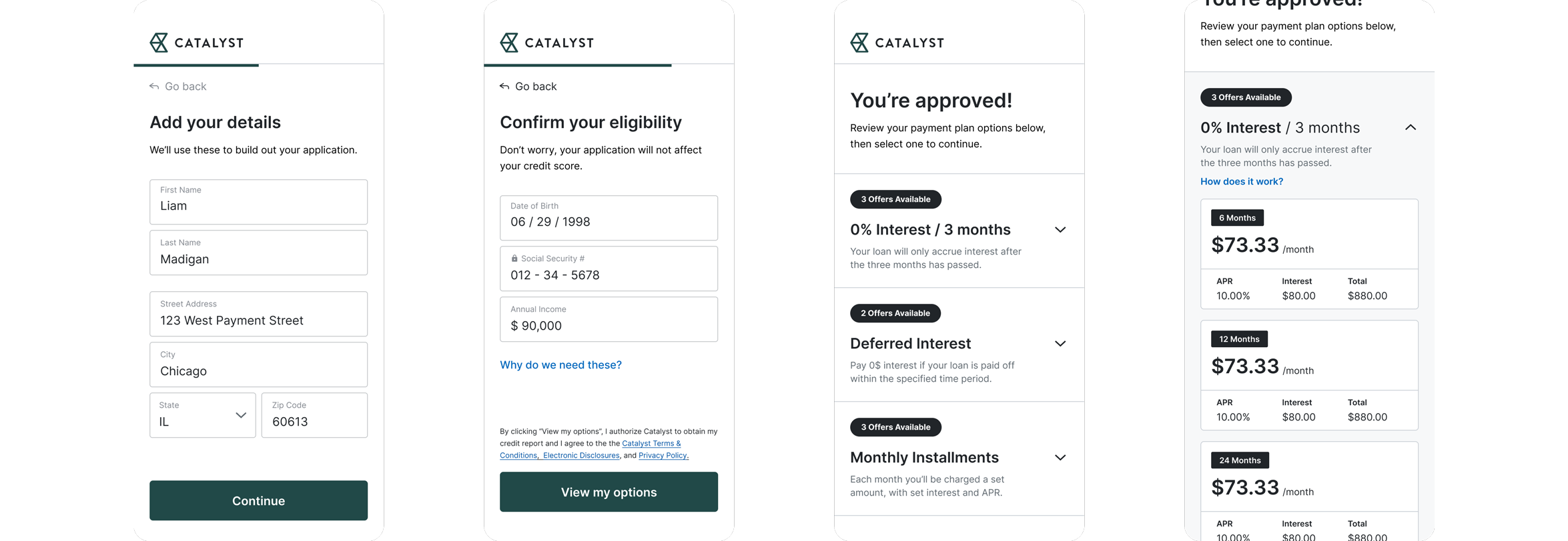
Unlike many of the competitive BNPL offerings in the market today, Amount’s PoS solution prioritized the opportunity to allow our partners to offer users a batch variety of standard or promotional offers.
With a myriad of potential approved loan offers for a single user, we needed to figure out a solution that was both comprehensive and easily understood. After initial discussions, I recognized that the expectations and interpretation of this problem varied greatly across team members. I approached this challenge with a heavy emphasis on team collaboration, transforming static discussions and processes into interactive ones to allow for an overall improved shaping process.
After conducting research about my audience and their experiences with task management, I created three distinct user stories that best encompassed the struggles my users will face.
Figjam Integration
With its real-time interaction and collaboration opportunities, Figjam presented an easy opportunity to facilitate collaboration and streamline communication among team members, ultimately leading to more efficient and effective project outcomes.
Using this, I planned, built and conducted a mixed offers workshop with all relevant stakeholders in our shaping process, focusing on ideating how we each perceived the presentation of multiple offers to our users, allowing us to generate a variety of potential solutions that helped define our final page structure.
After conducting research about my audience and their experiences with task management, I created three distinct user stories that best encompassed the struggles my users will face.
Iterative Testing
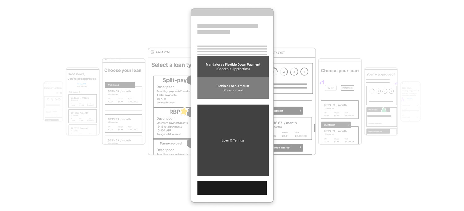
With our page structure solidified, I utilized other ideas and pieces from our workshop to produce five potential solutions for presenting mixed offers to our users. After reviewing with the design team, we honed in on three final potential solutions for our product, which would be internally discussed with stakeholders and teams.
After conducting research about my audience and their experiences with task management, I created three distinct user stories that best encompassed the struggles my users will face.
Horizontal Scroll through Offers
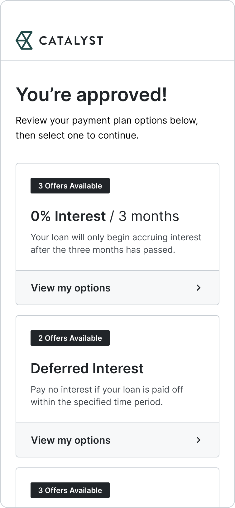
Bucketed Offers
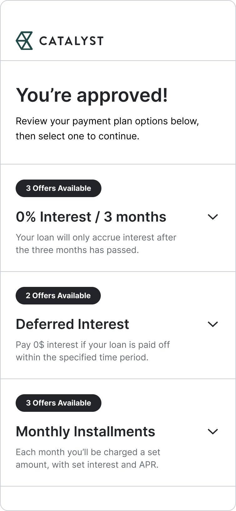
Collapse/Expand Offers
Overall, there was a strong preference for Option C, as it provided all the necessary helpful information while removing the jumping back and forth between pages from Option B. Additionally, Option C provided scalability while reducing the need for taking up so much vertical space.
Throughout the discussions, I also recognized a user need for clear and descriptive solutions to the inherent complexity of loan offerings and other aspects of repayment, such as offering down payments. After recording and sharing this data, my team was open to exploring two distinct solutions to expand user knowledge and comprehension.
After conducting research about my audience and their experiences with task management, I created three distinct user stories that best encompassed the struggles my users will face.
Financial Literacy Modals
Including opportunities for explanation and knowledge sharing increases transparency and improves user comprehension, ultimately leading to more informed financial decisions and greater satisfaction with the product.
Tile-based Components
I worked with our accessibility and enablement team to develop tile components such as our flexible down payment or loan amount, allowing us to easily accommodate the needs of our partners without disrupting our Whitelabel flow.
REPAYMENT + PROCESSING |
Surveying to explore how users are currently consuming their news.
How might we...
...afford a clear endpoint to our users and their chosen plan?
As the final piece of our flow, it was essential that the repayment section of our product was a transparent and dependable endpoint, enabling users to grasp the entirety of their repayment plan and the exact timing of their charges. Our team shifted its focus into conversations and ideating on how to handle this endpoint and input of payment information.
I again used Figjam to facilitate these discussions, only this time shifting it into a more passive form of collaboration. By turning a standard google document into a consistently active discussion, I helped to generate tangible and documentable action items for the team, streamlining the decision-making process and ensuring accountability and follow-through on all ends.
After conducting research about my audience and their experiences with task management, I created three distinct user stories that best encompassed the struggles my users will face.
From a design perspective, I recognized the opportunity to focus in on a distinct area of our solution: visual clarity. I wanted to design a tight set of UI components that presented a user's selected plan in an understandable yet compact way, allowing the "finishing point" of our solution to remain clear and descriptive across all selected payment plans.
After conducting research about my audience and their experiences with task management, I created three distinct user stories that best encompassed the struggles my users will face.
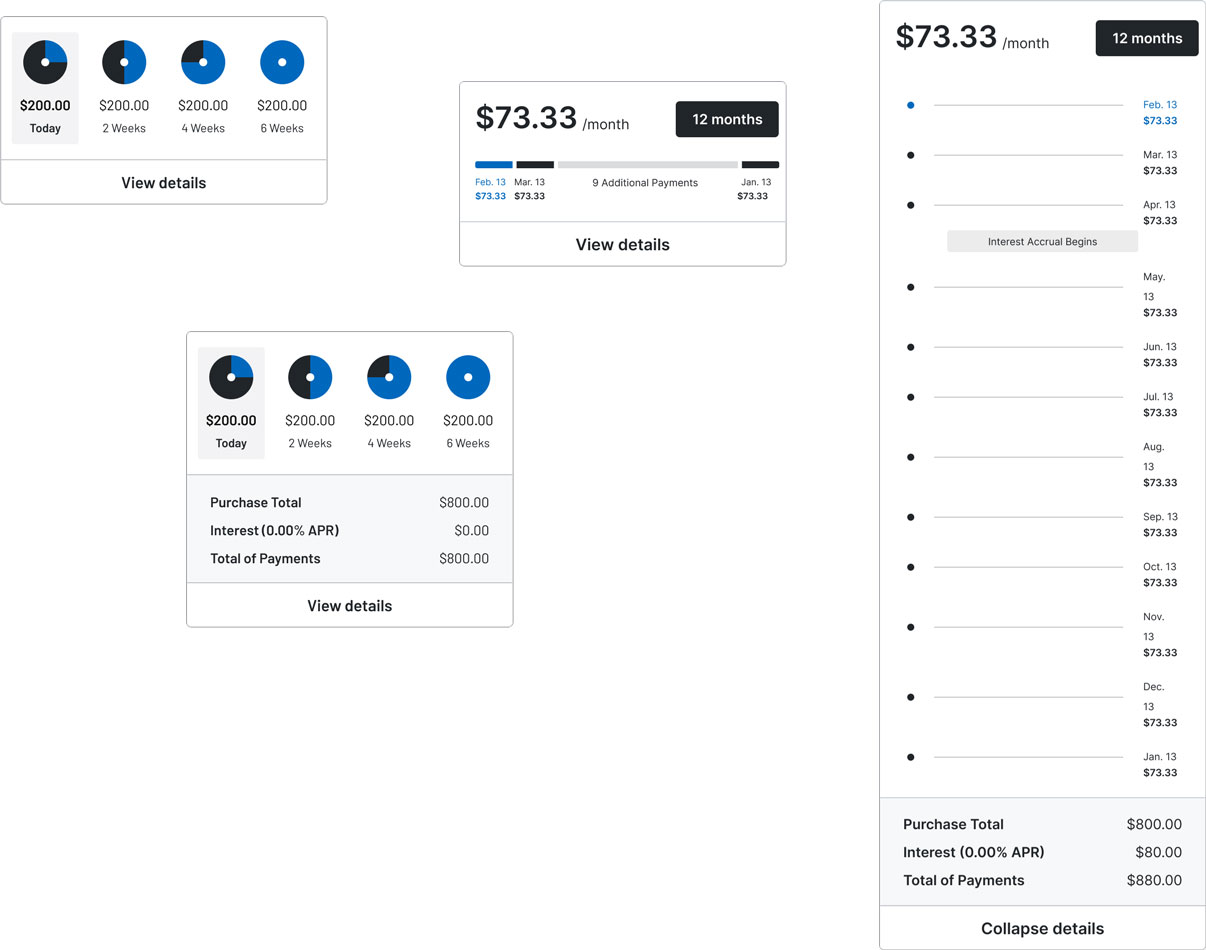
Payment plan tiles
A user's selected repayment plan should be presented in a way that is understandable yet not overwhelming, especially with plans stretching over a long timeline. To do this, I designed a collapsible / expandable set of repayment tiles that allowed a customer to view their plan from both granular and overarching viewpoints.
WRAP UP |
Surveying to explore how users are currently consuming their news.
By fusing my skillset in UI with my love for design thinking, I was able to design and work with my team to deliver a product that not only fulfilled functional requirements but also catered to the user's experience, resulting in a seamless and intuitive point-of-sale solution.

Increase transparency
By shifting Amount's static discussions into active ones, in which every seat at the table had a voice that could be clearly presented and heard, I was able to provide layers of transparency both within our shaping process and moving into our build process. With each stakeholder having a clear acknowledgment of action items and next steps, we were able to maintain a seamless workflow across all departments. In addition, generating componentized, templated documentation such as the competitive analysis artifacts provided the design team a resourceful and easily accessible way to generate tangible documentation for our projects.
After conducting research about my audience and their experiences with task management, I created three distinct user stories that best encompassed the struggles my users will face.

Prioritize Collaboration
Amount's approach to shaping started off extremely static, with many wires getting crossed due to a lack of cooperation, discussion, and communication. To resolve this, I heavily prioritized incorporating new technologies such as Figjam into our workflow, infusing collaboration and allowing our processes to evolve from static to heavily interactive experiences.
After conducting research about my audience and their experiences with task management, I created three distinct user stories that best encompassed the struggles my users will face.

Test Often
Though once relying on internal opinions and hypotheses to guide our decision-making and feature production, utilizing my skillset in user testing allowed concrete data directly from potential users to be the pillar for our engagement and discussion, ultimately rewiring the way Amount stakeholders considered and approached product and feature creation.
After conducting research about my audience and their experiences with task management, I created three distinct user stories that best encompassed the struggles my users will face.
By incorporating a design-forward approach into the Amount shaping process, we were able to gain a deep understanding of the challenges and pain points faced by users, which helped to identify key areas for improvement. This allowed the team to focus on creating solutions that would best meet the needs of our users, rather than simply pushing for what was easiest or most convenient.
As a result, we were able to develop a highly effective process for shaping Amount that greatly improved the user experience. Additionally, the success with this approach allowed me to join Amount's Software Development Life-Cycle Committee as the advocate for design, making sure that the company's upcoming reorg accurately accounts for design and its benefits within the processes.
After conducting research about my audience and their experiences with task management, I created three distinct user stories that best encompassed the struggles my users will face.
LIAM MADIGAN
CHICAGO, IL
© 2025
LMADIGANDESIGN@GMAIL.COM