APP BUILDER
Lead Designer
Web Desktop
2 Months
Amount initially handled client requests for loan application updates manually, which was time-intensive and took up valuable team capacity and resources.
To solve this, we built a Self-Service portal that gave partners direct control over their application products. I led the design of the Application Builder module, enabling users to update, edit, and add to their applications through an intuitive configuration workspace.
PRODUCT INTENTION
Understanding design and product intentions.
The first step in our process was to collaboratively identify and process the core needs and challenges of the application builder module. I worked directly with product owners and developers to understand initial constraints and expectations.
Additionally, we leveraged direct discussions with our partners to map out the goals of the module. Because the user groups of this product were niche, discussions with partners became a crucial opportunity to create feedback loops and iteratively improve upon our designs.
Global Configurability
The module itself had editing functionality baked into nearly every component of each page, within elements both broad and granular. As such, the UI had to seamlessly accomodate configuration at all levels.
Handling Complexity
There was a wide range of complexity to be expected as a result of providing configurability across all components. A core goal between product and design was to provide a seamless experience that felt above all simple to use.
Application First
Though users would be directly editing and updating content as needed, the experience of the module needed to prioritize visual recognition of the pages themselves, ensuring user comfort in viewing their configurations and how it impacts the overall application.
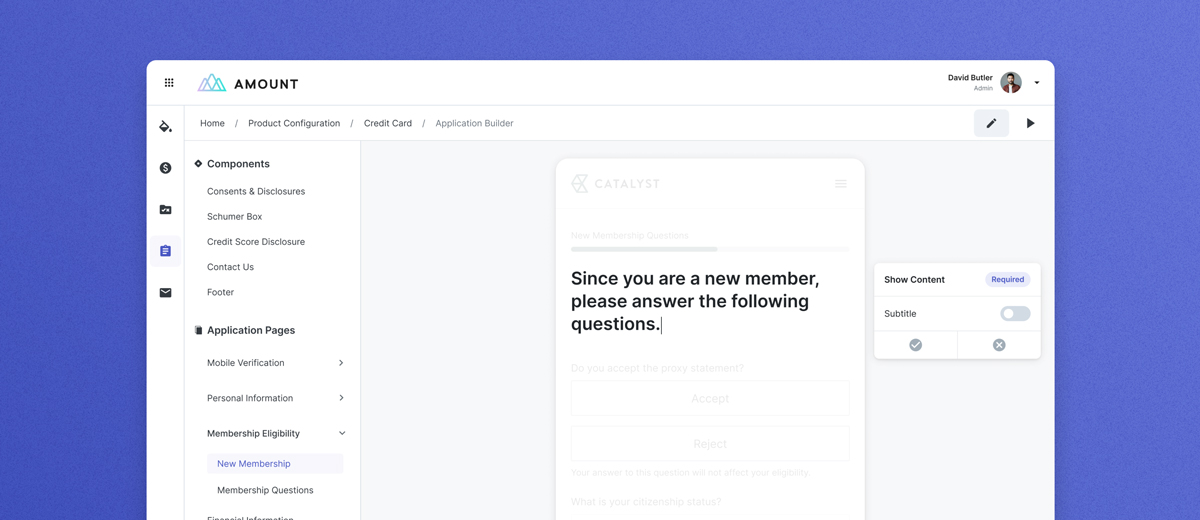
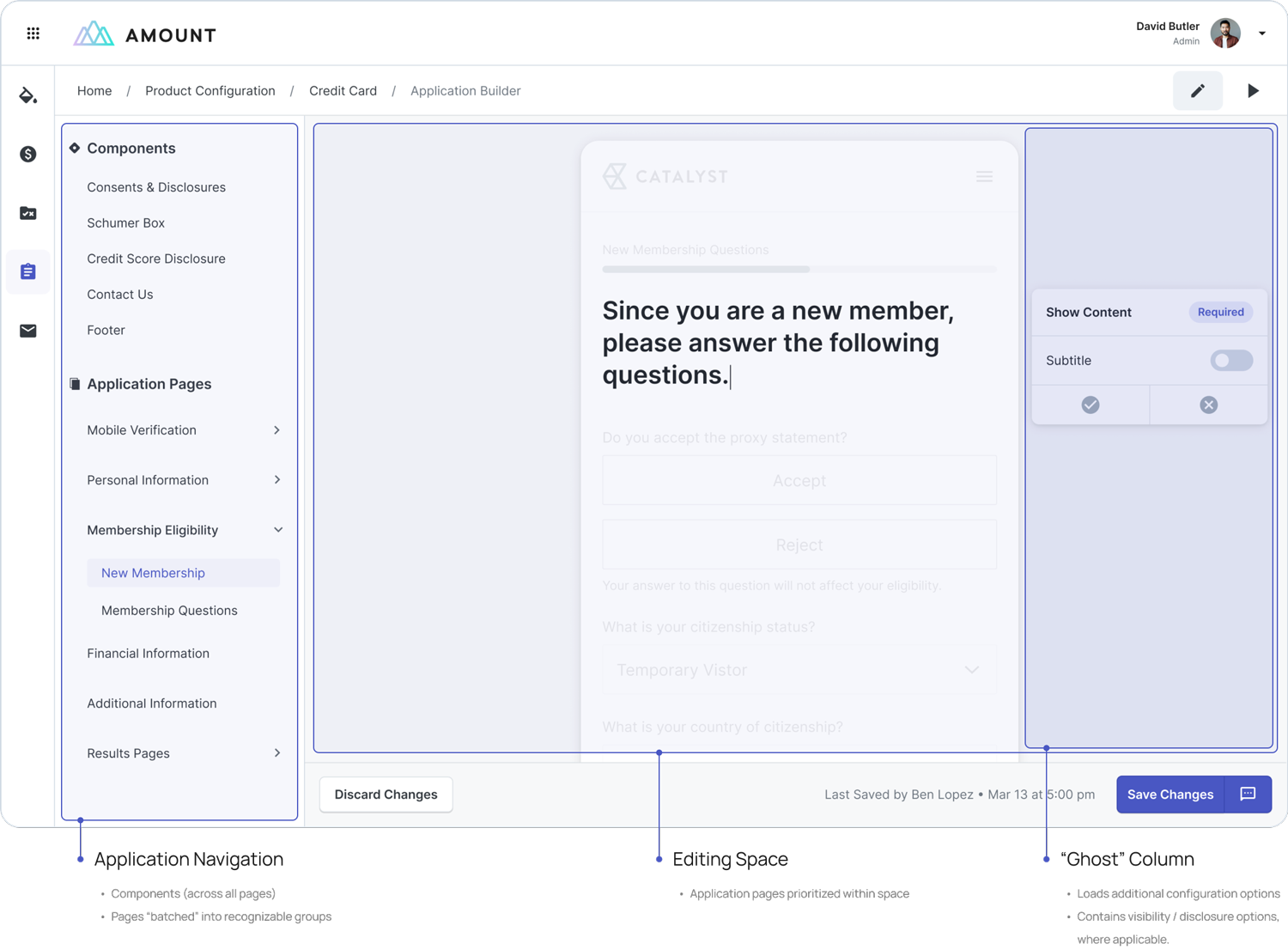
Because of the varying levels of complexity, the compositional structure of the UI needed to be simplistic yet easily navigable. The module layout streamlines navigation through vertical tabs of the application pages, utilizing grouping and nesting where necessary.
As editing was such a core part of the experience, the bulk of the remaining space is utilized for displaying configurable pages and content. Additionally, to accomodate detail views and functionality while editing there is a "ghost" column fixed to the right side of the product, which can be used to generate additional editing details if needed.
INTERACTION DESIGN
Defining a flexible interaction model to guide our process.
A core part of the design process for the module was fleshing out and defining the interactions of content editing. Application pages sat across a wide spectrum of complexity, with each page having a different set of content that could be configured.
To guide the design process, I mapped out some guidelines that allowed for configuration interactions to be streamlined across all pages, starting from a top-level perspective and narrowing it down into nested editing. The interaction model naturally builds upon itself through layered touch points, ensuring that at every level the UI affords clear affordances to the ways in which a user can interact with the product.
Focus Hovers
Configurable content relies on hover indicators within the application page, providing clear affordances to editable content for users.
Entering Focus State
Users can click into a focus state for content they want to configure. Other page content fades to the background, with focused content keeping prominence.
Nested Editing
Interaction with editable content follows a "drill down" approach, with additional configurable content appearing once a user enters a focused state within the application page.
In addition to defining the interactions of the core experience, additional functionality and considerations were defined for the module itself. These "bookends" of the model assist in guiding users into the interaction pattern as well as defining consistency for handling a wide range of configurability options.
Focus Indicators
The module flashes all focus states for a brief period of time upon entering a new application page, allowing users to get a clear glimpse of what content can be configured without becoming obtrusive.
Proximity-based Configurations
For some pages, additional configurations needed to be accomodated within the UI. In these cases, the module utilizes configuration components to the right of the focused content. Alternatively, if another layer of configurations is needed, they are loaded directly beneath, following a "cluster" method of interaction.
UI DESIGN
Utilizing peripheral components to support the editing experience.
Though pages could house direct editing such as text control, it became clear that the envisioned product needed many more layers of configuration than what could be cleanly presented within the application pages.
Surfacing additional configuration options with an accessible yet non-intrusive editing panel.
The panel’s appearance is triggered whenever a user enters a focused editing state, occupying the "ghost column" directly to the right of the content. The panel itself allowed us to support additional configurability while avoiding unnecessary UI clutter.
Ensuring editor panel understandability.
The panel utilizes a progressive disclosure approach to allow for information to be accurately condensed and revealed based on necessity. Toggles are utilized in turning configurations on/off, allowing for familiarity and ease of use.
The UI of the editor panel naturally adapts to the additional editing options of the focused content, allowing additional details to be entered and stored compactly.
Editing existing application pages
Text Configuration
Text editing is handled directly within application pages, and can be edited immediately upon entering a focused state on content within the page.
Text configuration is available across all content- including control within question titles and, for some content, individual labels. Configurability follows the precedent set within the interaction model, aligning with a "drill down" action to edit specific content.
Hiding and showing application content
Users can control the visibility of select questions through the editor panel visibility toggle. The application adjusts to hidden content with visual indicators placed in-line with the content.
Additionally, hidden content is clearly denoted within the ghost column, and utilizes hover-state information as well as a simple undo action to make hidden content visible.
DESIGN PROCESS
A centralized hub for consents and disclosures
Because the loan decisioning process is reliant on consumer data and applicant information, disclosures and consents were given a prioritized and separate "hub" within the Application Builder module.
Disclosure Links
Links are loaded into the product as individual components, contained within the Consent & Disclosure section.
Configurability:
○ Text / title editing
○ Link "on-click" functionality
Consent Groups
Disclosure links then combine to form consent groups, which can also be edited within the Consent & Disclosure section.
Configurability:
○ Consent confirmation functionality
○ Add / remove additional disclosure links to groups, if needed
Page Application
Consent groups can then be added to specific pages where applicable. In such cases, floating action buttons are present.
Configurability:
○ Standard visibility controls
○ Remove consent group from page
The product loads existing disclosures and consent groups automatically based on legal decisioning, which users can then directly edit and apply to application pages. To simplify the process for partners, the module loads "sample" disclosures and consent groupings with built-in configurability.
The consent-building process starts out granular and naturally expands, beginning with defining disclosure links and ultimately ending with adding a consent grouping to an application page.
Editing a disclosure link
Users can edit their disclosure links title and on-click interaction through the module. Users have the option of having disclosures open new tabs, uploaded PDF's, or a modal, with the interface naturally adapting to handle configurations.
Creating a consent group
Due to legal regulations, consent groups cannot be generated organically by users. Instead, consents are loaded in pre-defined groups of disclosure links directly into the module. Users can then configure groups as needed, and add any additional links to the group if they desire.
Adding a consent group to an
application page
Pages that are applicable for additional consents have a floating consent button within the right-hand side, allowing users to add a consent group with a simple click.
DESIGN PROCESS
Allowing users to create their own customized questions page
In addition to configuring existing application pages, from direct partner feedback, we learned that having a fully customizable page that partners could add their own unique questions too would be a large selling point.
Working with stakeholders as well as developers, I fleshed out the dynamics and experience of the Custom Questions page, including restrictions and overall approach. Users would be able to add up to seven customized questions, controlling the typing and content of each.
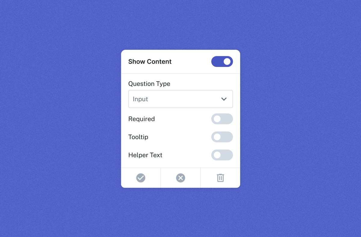
Evolved Editor Panel
Because of the additional customization options associated with the Additional Information module, the editor panel needed to be expanded to match. In addition to the toggle-based controls of the panel, within the module users have the option of directly controlling question types, as well as deleting a question and its content completely.
Inline Question Creation
Though standard page editing utilized the right-side ghost column to add additional content to pages, an exception was made for the Additional Information module.
Users can directly add a question through a persistent button nested within the custom application page itself. In doing so, the UI assists in creating an understandable, linear process of adding custom questions to the page.
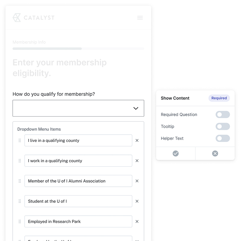
Adaptable Question Types
Users can easily switch between different formats through the updated editor panel. Page content parallels the chosen question type, with the UI and information collection intentionally mirroring what the component will look like within the finalized application, such as with dropdown options.
Results + Learnings
75% reduction in onboarding time
Since the launch of the self-service software, Amount has drastically reduced the time to onboarding for its partners, allowing resource and cost improvement across the board.
Partner Expansion
The self-service product environment has allowed Amount to expand its partnerships to five new insitutions and their nested credit unions.
SaaS Model Improvements
Through the launch of this product, Amount was able to seamlessly transition their software away from whitelable solutions and towards SaaS offerings, allowing them to showcase their capabilities in an increasingly competitive environment.
LIAM MADIGAN
CHICAGO, IL
© 2025
LMADIGANDESIGN@GMAIL.COM