ADMIN PORTAL
Lead Designer
UX / UI / Prototyping / Hand Off
2 Months
As part of its push towards a SaaS initiative, Amount recognized that some if its traditional onboarding methods were outdated and in need of improvement. Though it did the job, reliance on complex documentation and laborious information collection lead to an increased chance of user error and miscommunication, placing stress on both product and potential partners during onboarding.
As the lead designer for the Admin Portal, I transitioned Amount's static documentation approach towards a layered web environment that streamlines the onboarding process and increases transparency, organization, and satisfaction. This case study portrays the approach, thought, and challenges behind the design and build of this product.
Primary Contacts + Objectives
Product
One product owner, one project manager
Focus Points:
○ Identifying and building client / user pain points
○ Building of functional requirement documentation from a holistic, UX perspective
Development
One lead developer, two additional
Focus Points:
○ Understanding capabilities and restraints based on technology used
○ Running QA on implementation and providing design guidance
Clients
Financial institutions, internal product employees
Focus Points:
○ Leading client discussions to understand and analyze user frustrations / needs
○ Gathering requirements and improvements through impromptu "testing" sessions
Understanding relevant processes and pain points.
I worked with product owners to analyze and break down Amount's current partner processes, researching the common pain points and potential areas of improvement within our onboarding process.
Working with developers, I helped set up an agile approach to design and handoff that worked in tandem with the tight timeline between initial concept and targeted launch date for our MVP.
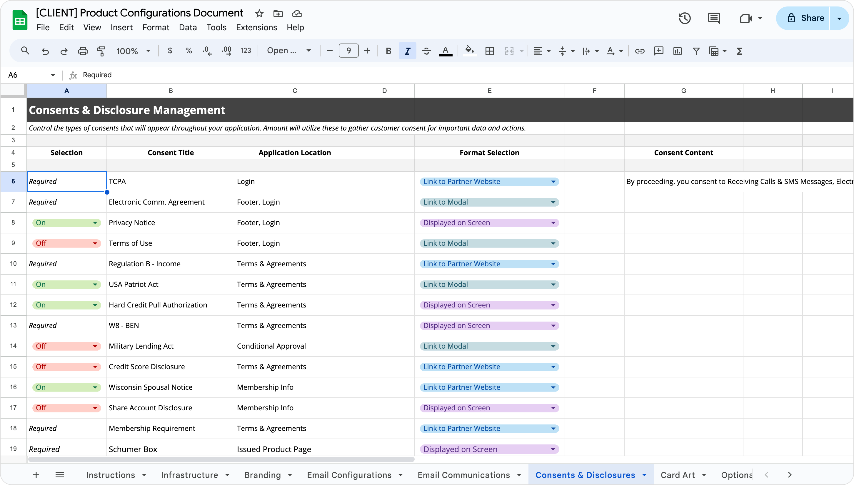
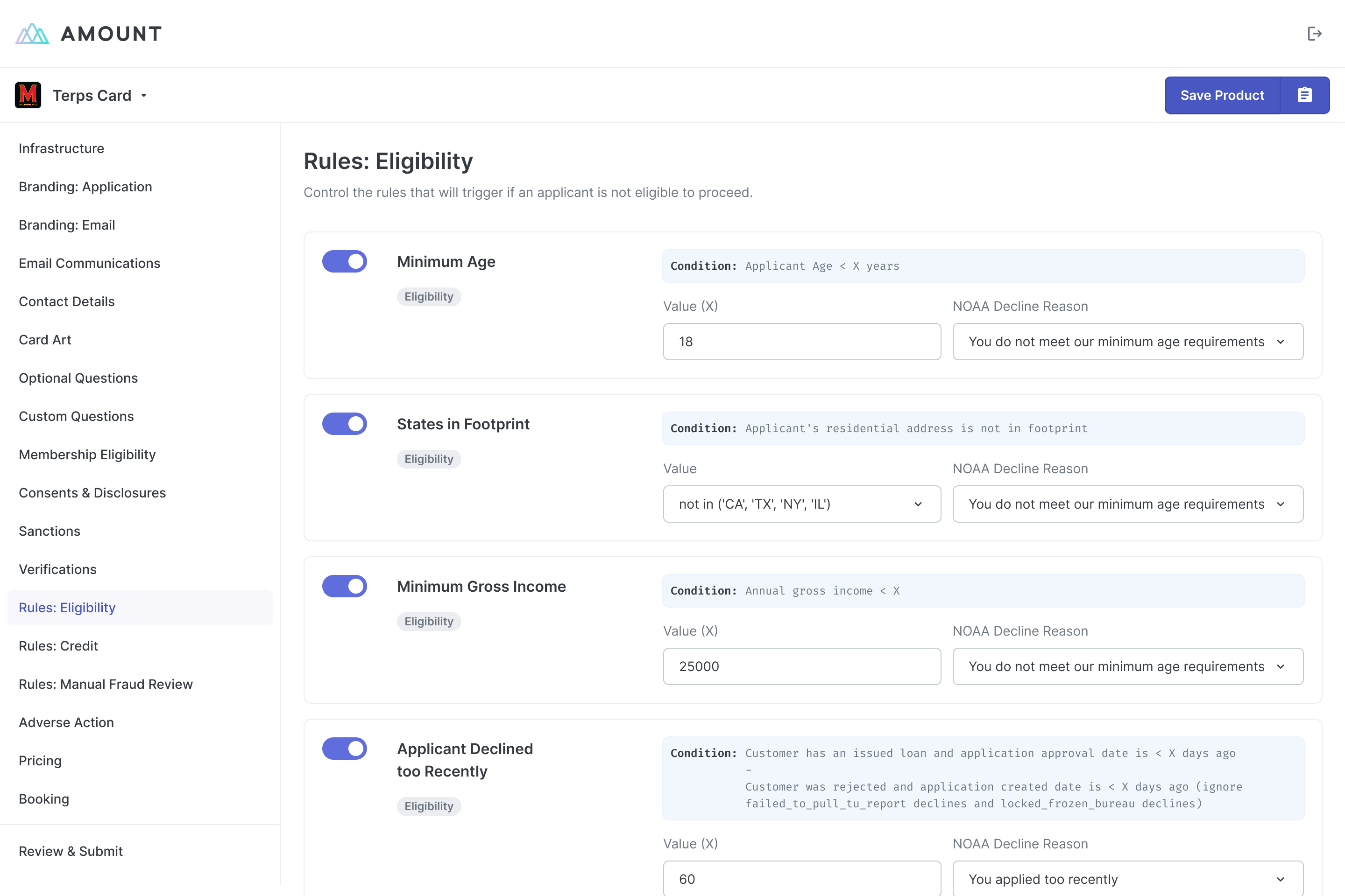
Amount's traditional configuration documents were functional yet overwhelming. Partners were expected to correctly navigate and fill out spreadsheet modules that in total containied more than 500 sets of data and options to choose from, revealing an area of burden that could be lightened through our product.
From research, it became clear that the groundwork behind our MVP needed to expand beyond just mapping required configurations into a digital environment. Information presentation, simplified interactions, and reduced cognitive load became core pillars for the UX of the product.
Pain Points
Miscommunication
Terminology common to internal product employees often became insufficient and confusing to partners, leading to an increased need for follow-ups and circle backs.
"How might we increase clarity through a more generalized design approach?"
User Error
Due to the repetitiveness and overwhelming layout of the configuration document, often partners would mistakenly leave certain configurations selected that they did not want. If not caught manually, the build of their product would be incorrect.
"How might we decrease potential errors through a clear, concise "review" process?
Partner Autonomy
Though it increased client/company communications, the general process of the configuration collection stage felt like it expected handholding to be more commonplace than necessary.
"How might we create a product that allows partners the trust and confidence they need to build their own product?
An agile build process.
Adapting to the time crunch we were under as well as working with limited team capacity, we approached the product from a "dive and conquer" perspective, simultaneously working in tandem to gather and analyze requirements, produce designs, and work towards and MVP build of the product.
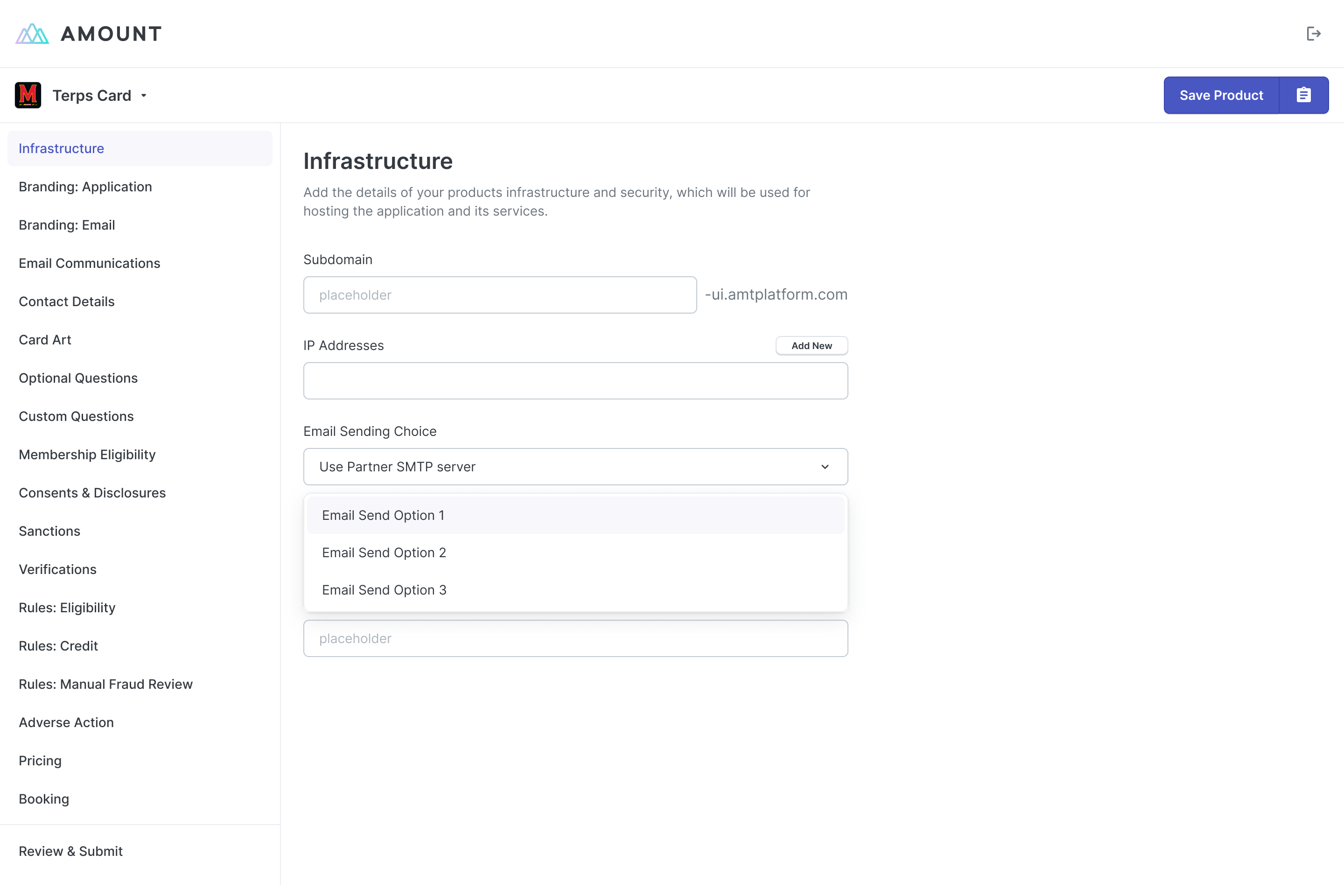
Tech Stack
Ruby on Rails
Utilized as the primary codebase for the Admin Portal, both due to familiarity from the development side as well as numerous Amount dashboards previously being built on it.
Though being used for the MVP, future iterations of the product were meant to utilize React.
jQuery
Utilized for increased availability of interactions such as expanding and collapsing components within a configurations module.
Vue.js
Utilized to bolster the UI and more closely match CSS elements according to what was handed off between design and development.
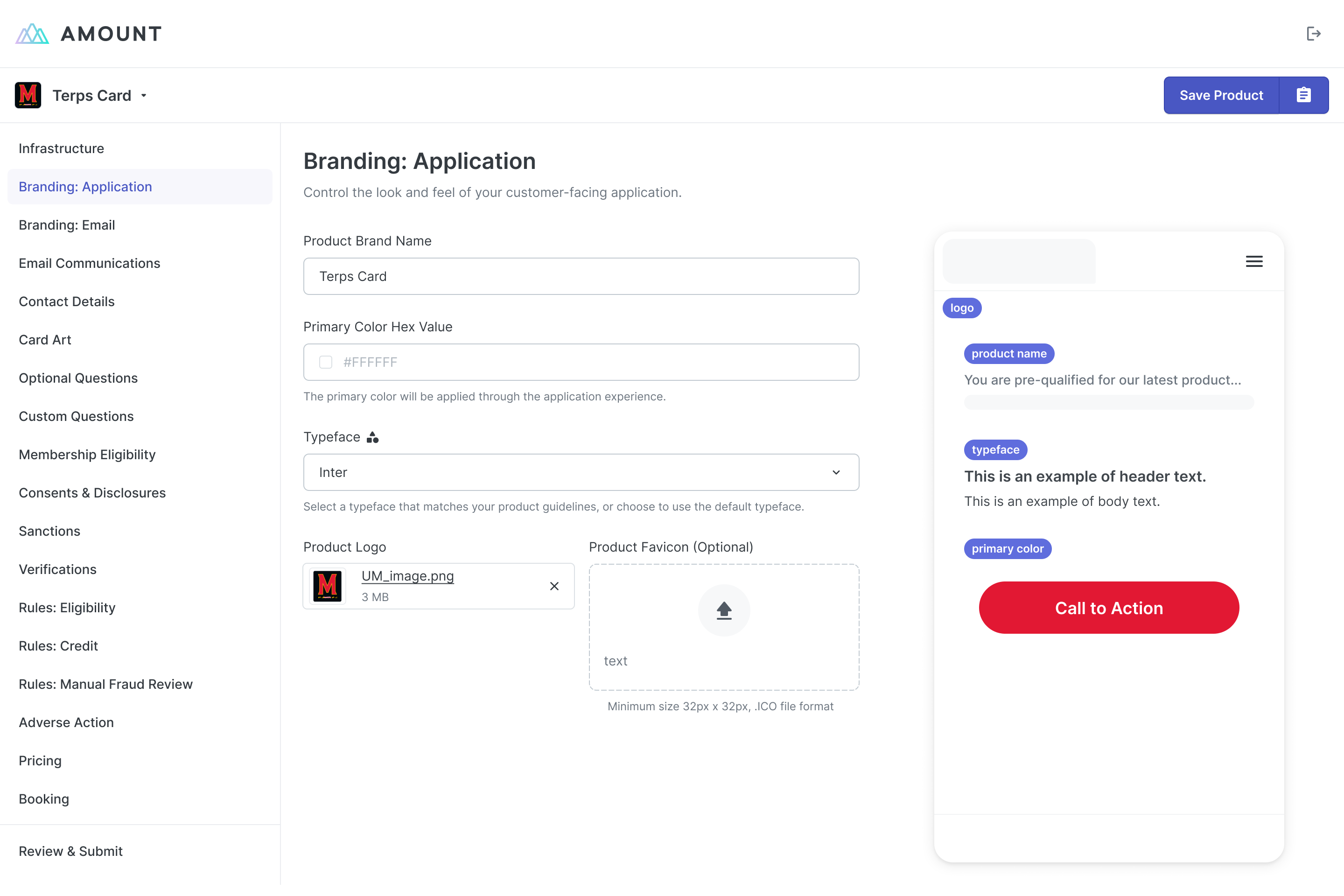
Standardizing the product interface to streamline hand off.
Because the timeline we were working within was tight, it was crucial to be able to map out product navigation and effective "clustering" of modules within the portal. I worked with product owners to establish a realistic ordering of modules, and on my own sketched/wireframed out potential layouts for the portal.
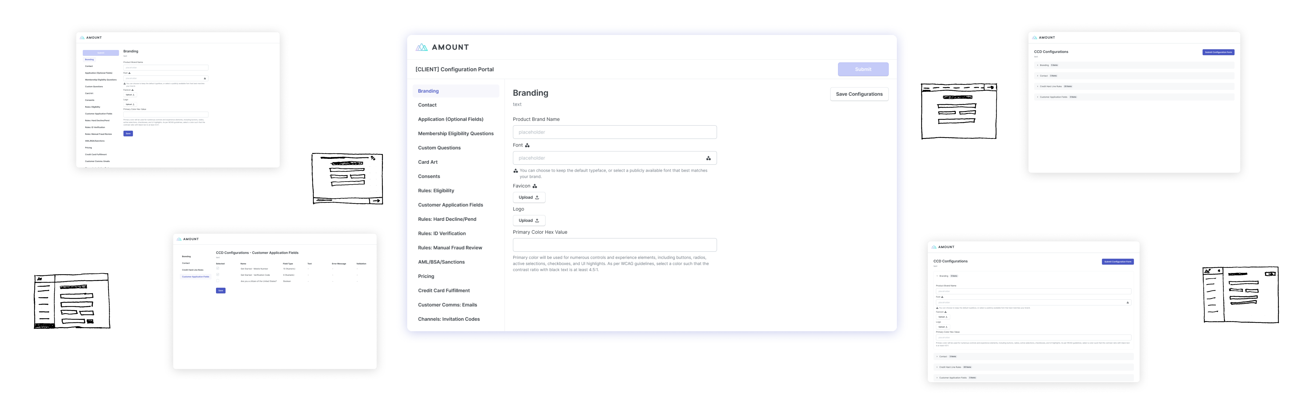
To streamline our design creation and handoff, I also pulled out "patterns" to the configuration document itself, analyzing repetitive tasks and directions to template our UI creation and rapidly speed up handling of module creation.

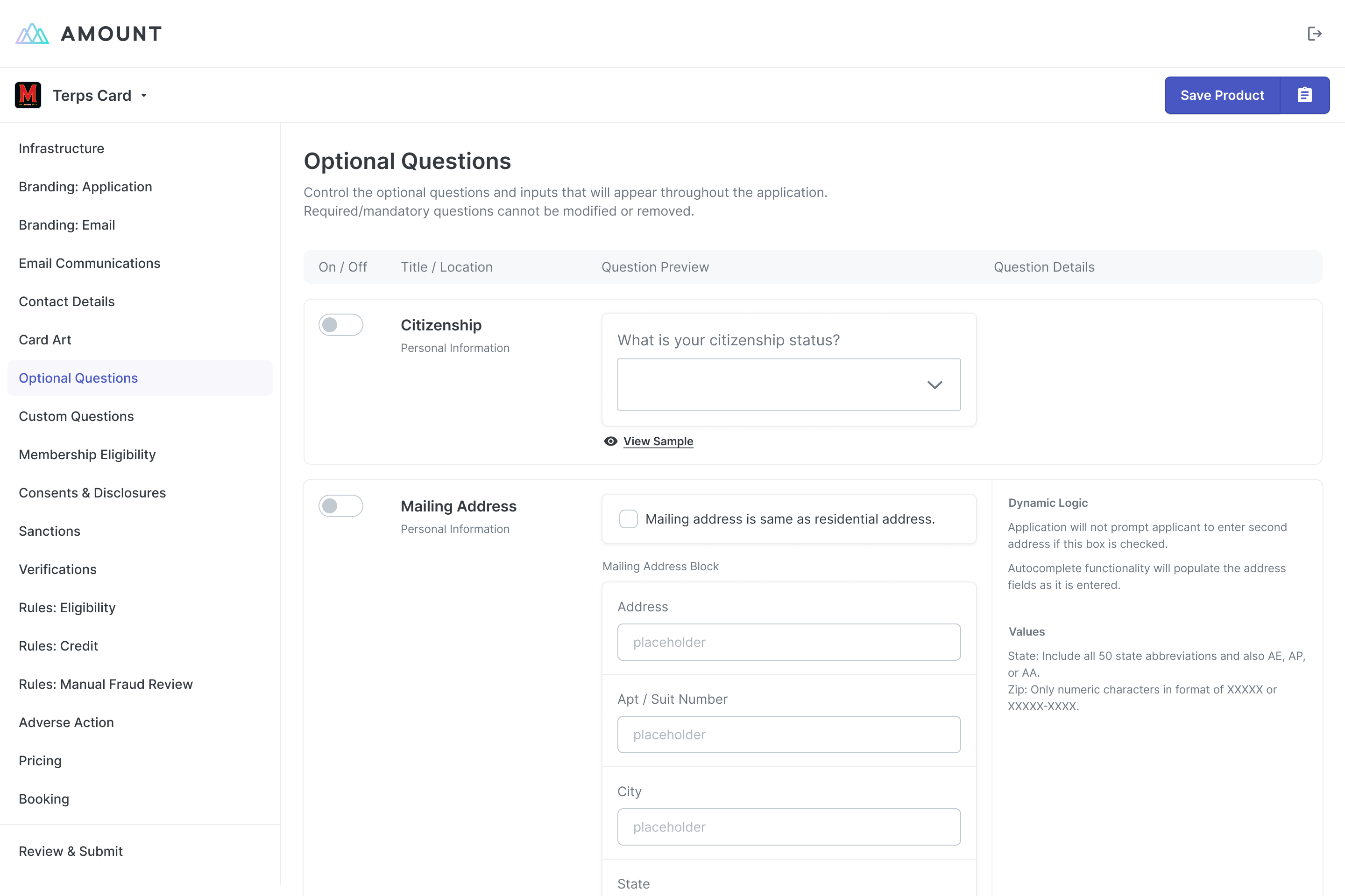
Form
Input-related configuration collection through a static and straightforward layout.
Ranking
Allowing users to rank and prioritize the specific configurations of a module.

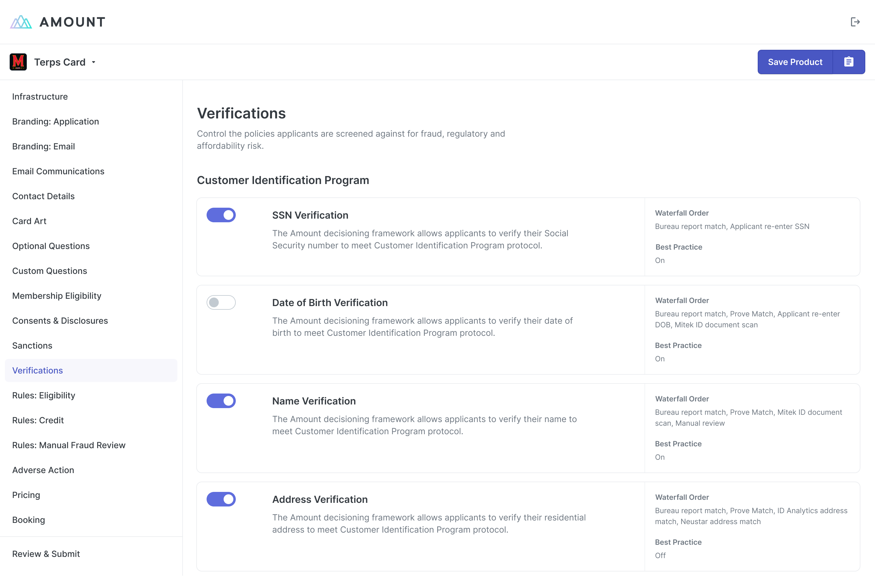
Switchboard
"Switching" of configurations on/off in a streamlined manner.
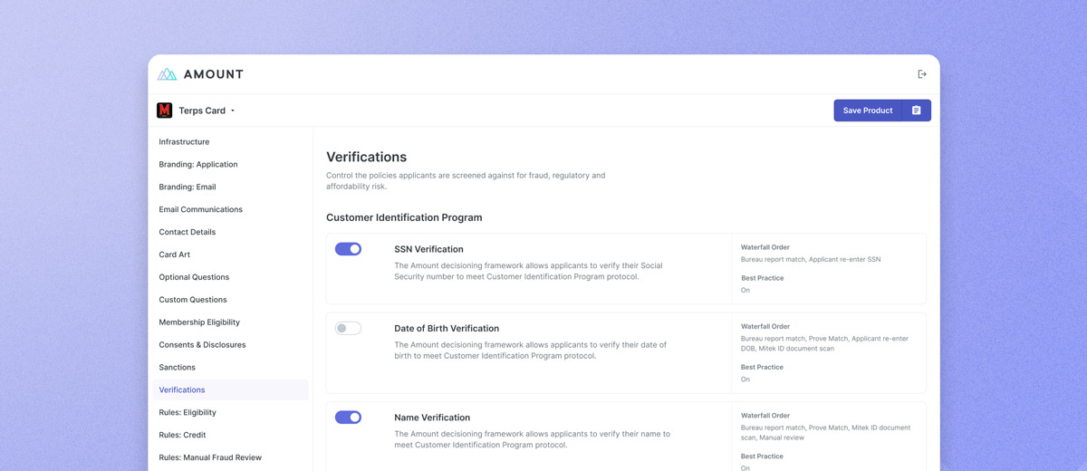
At the center of the majority of module layouts is the card component, which is designed to consolidate necessary information into a scannable area.
The anchor point of the card is the toggle, simplifying a crucial interaction of the portal: opting into or out of a configuration. From there, the card design is flexible to accomodate varying information depending on its use case.
Streamlining the UI container of the portal allowed us to effectively "hit the ground running" when it came to collaboration and handoff. Building up from the atomic level of the card component and into defined "templates" allowed for a more intuitive process between design and development.
Handling increased complexity through collaborative, user-focused methods.
The content of some pages had requirements that exceeded the templates I had defined. In these cases, I set up isolated workflows between myself, product owners, and developers in order to further understand and ideate on potential solutions.
We gathered feedback from both internal users of the current onboarding framework as well as our direct partners, ensuring that our solutions were feasible across all points of the spectrum of users.
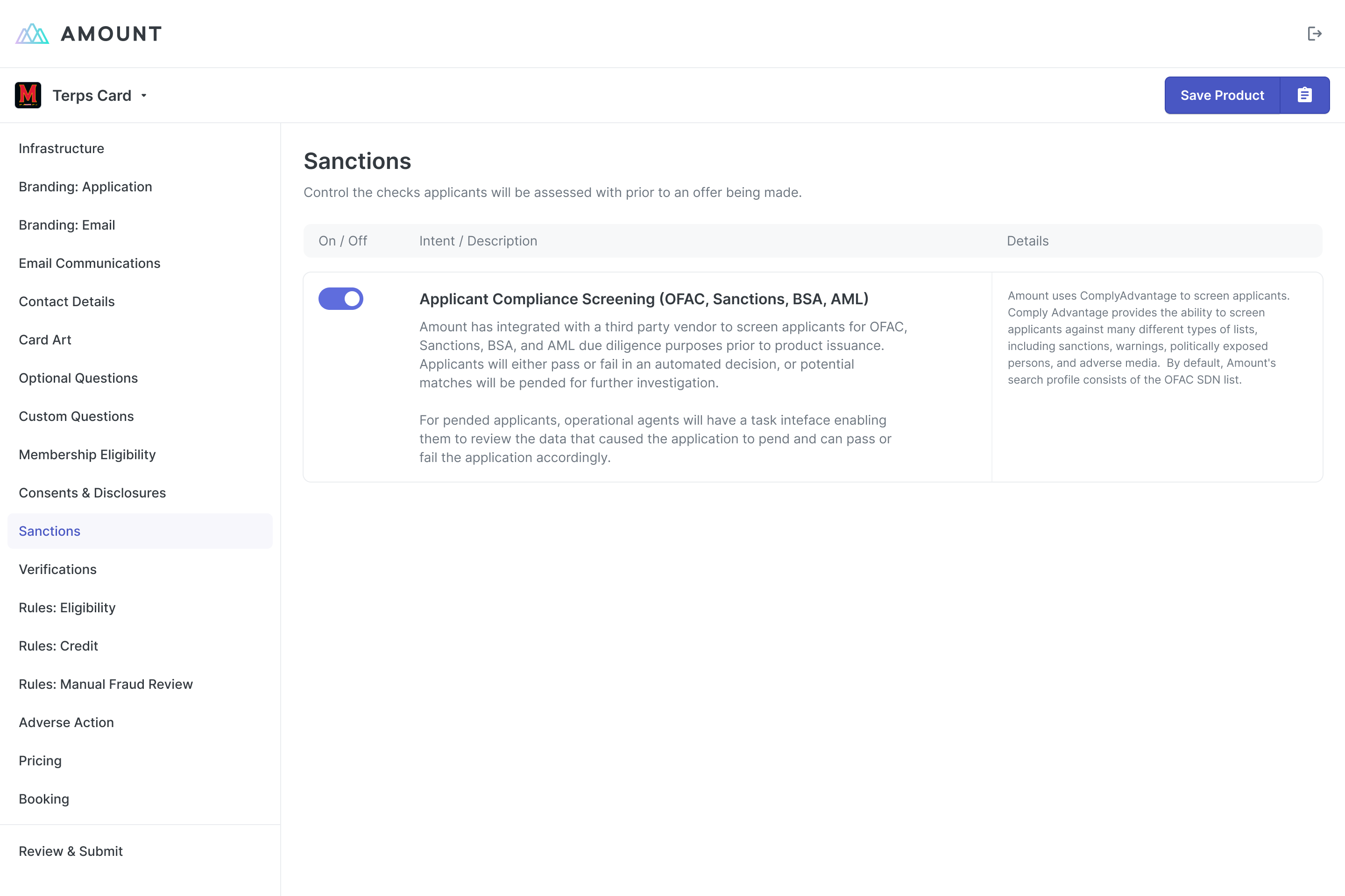
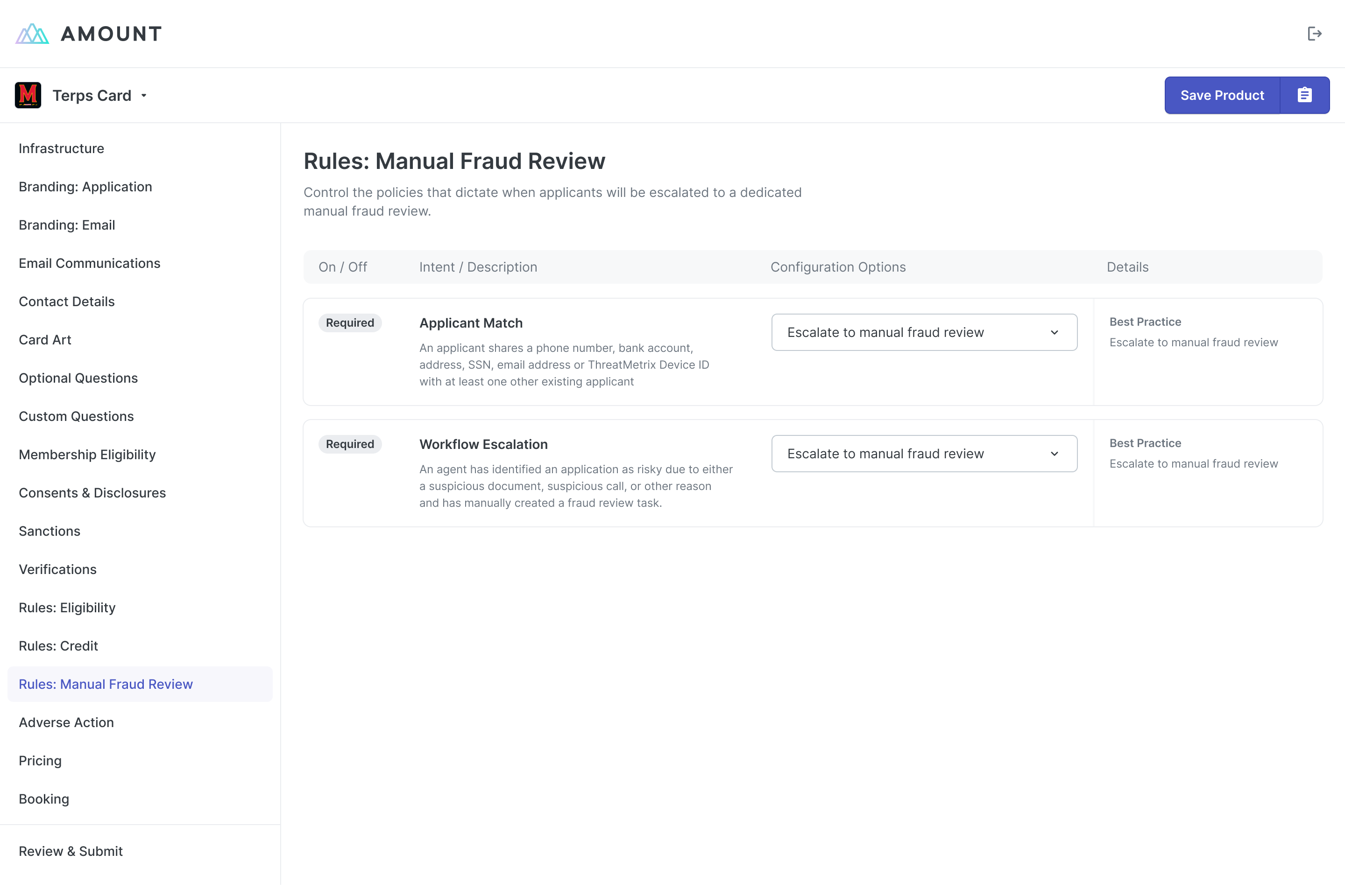
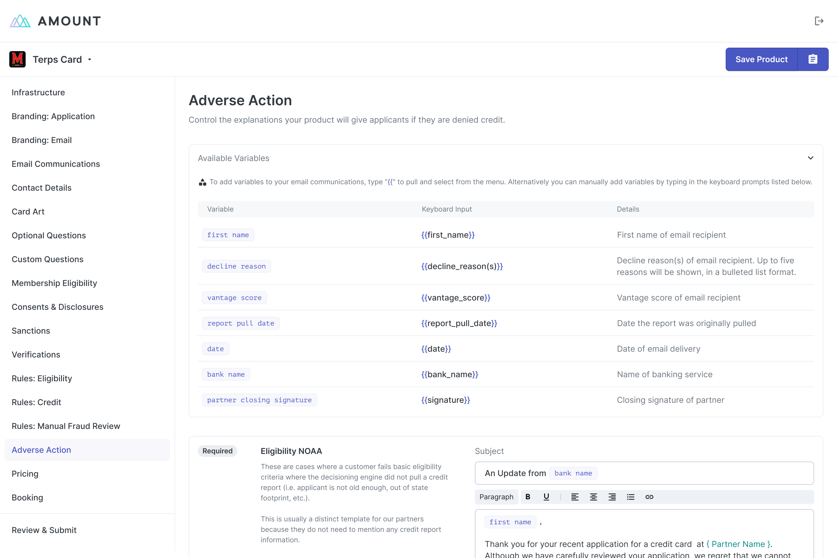
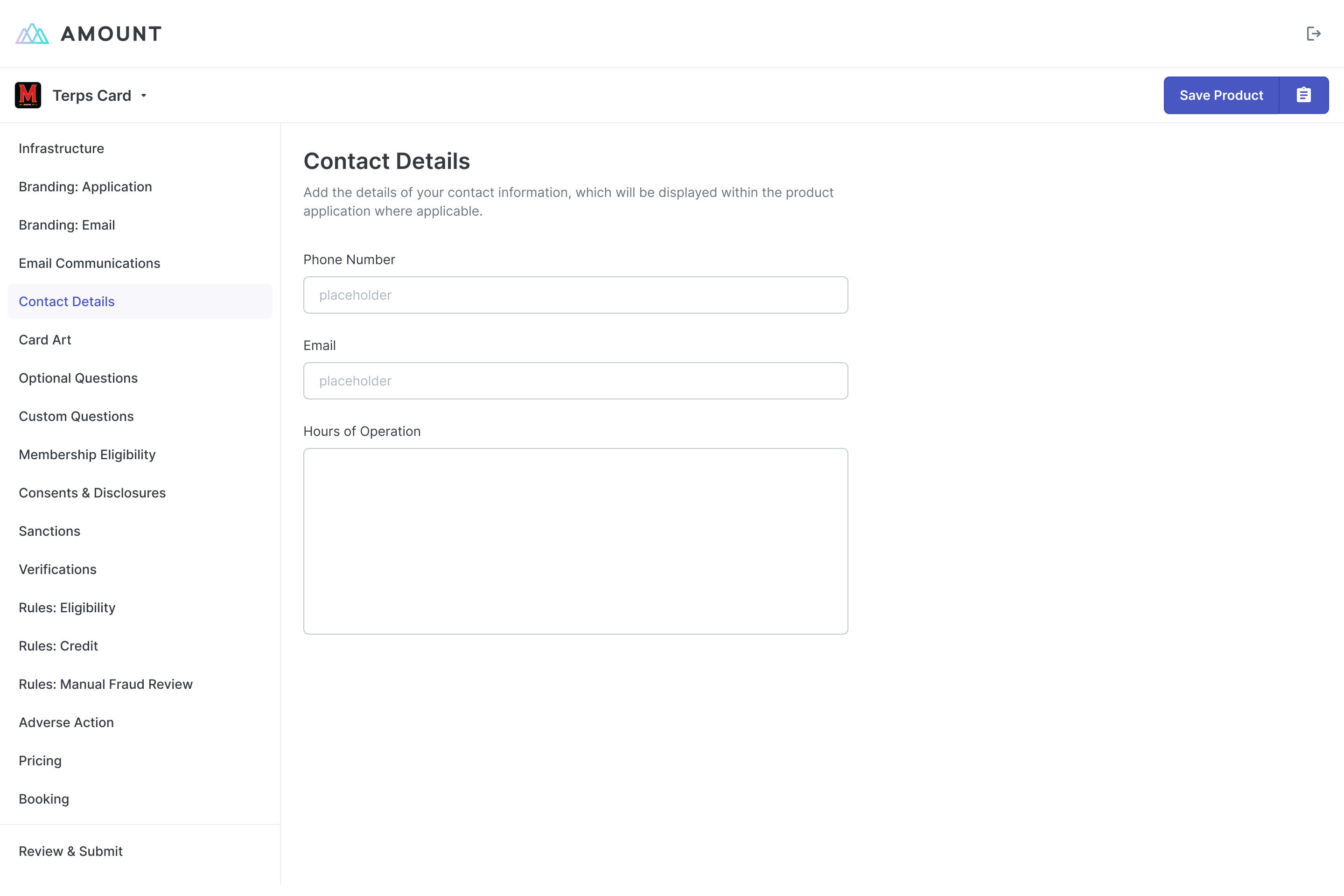
Membership Eligibility
One partner request was the need for an eligibility module within their application build. Credit Unions utilize these questions to verify their applicants during the decisioning process, with the approach varying across different unions.
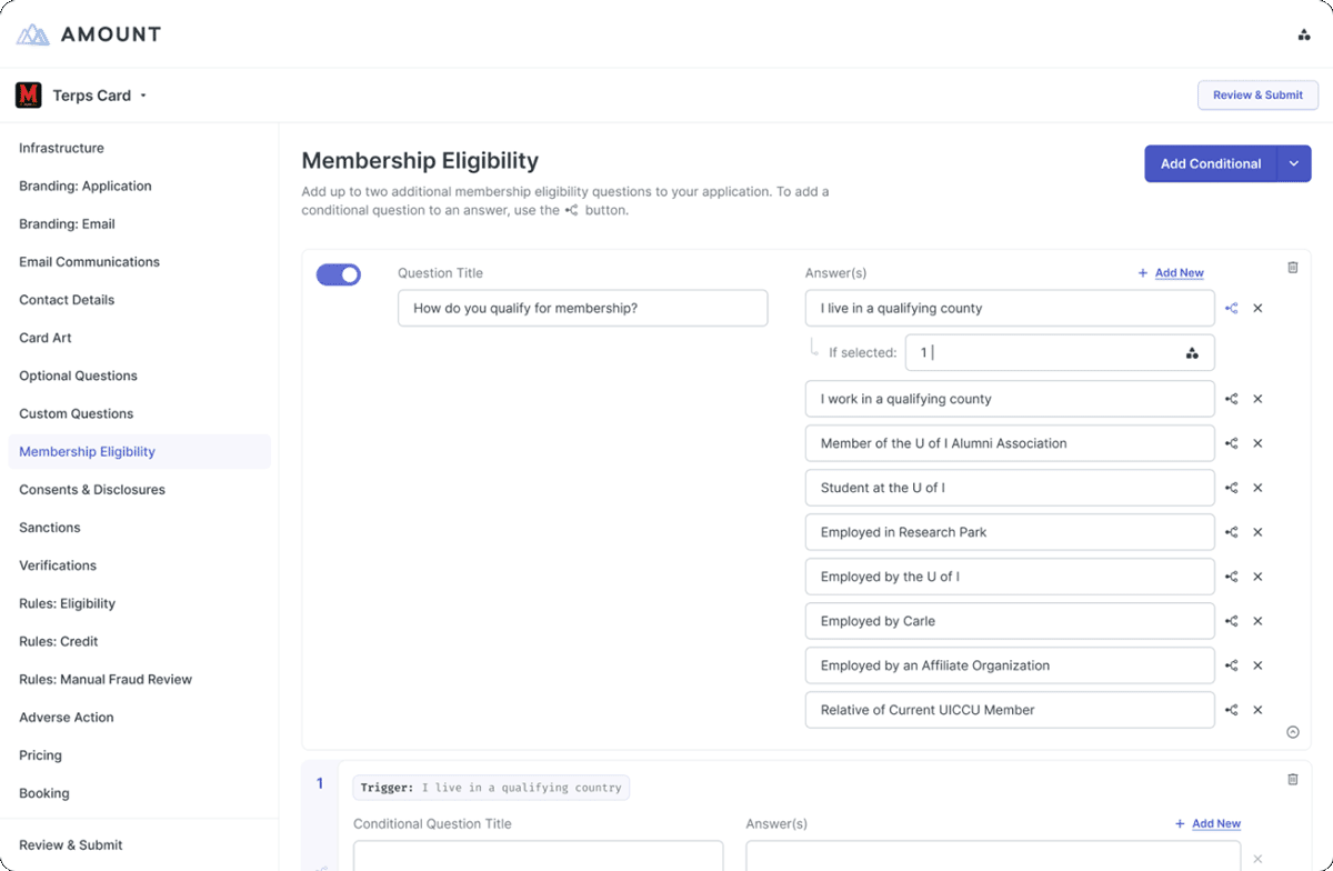
Credit unions needed to be able to customize their content in a conditional way, where the answer to one question could prompt a secondary question for the applicant to answer. Though applicants could only be asked two questions in total, due to the initial answer and the secondary question being tied 1:1, the amount of conditional questions a user could input were not limited, so long as they had an initial answer to tie them to.
Alternatively, users could opt to have two entirely individual questions, with no conditional questioning tied to either of them. Through discussions with current and potential partners as well as internal interviews, we discovered that the approach widely varied across credit unions, adding an additional layer of complexity to handle.
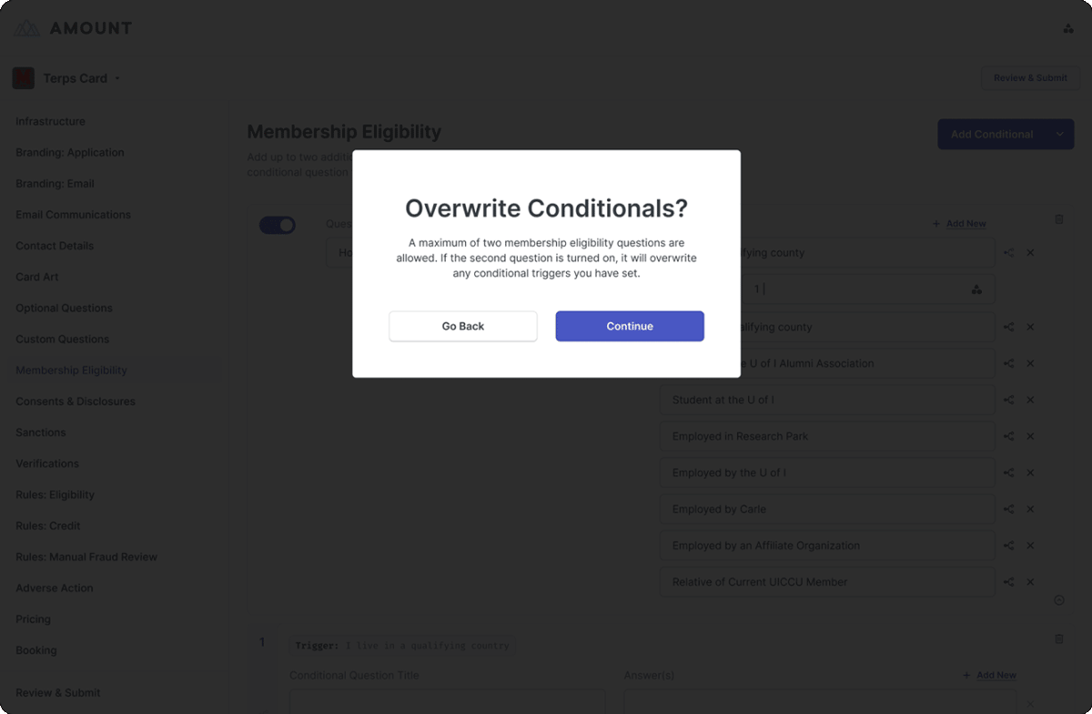
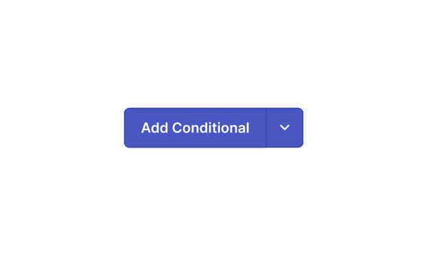
My initial approach to the module aimed to tackle both use cases in one flexible environment. Users could freely add conditional questions using the primary CTA, or could directly add and link their questions using the conditional icon to the right of an answer. Additionally, users could add an individual question through the segmented button, at the cost of overwriting any existing conditional questions that had been added.
Though the initial design accomodated multiple use cases, reviews with the team raised concerns regarding the overall understandability and clarity of the module's design.
Misbalance of choice
Primary CTA is given to adding a conditional, but what about partners that only need individual questions?
Forcing linear progression
Tethering conditional question creation so tightly to a dropdown option feels too "happy-path". How can we adjust entry points to accomodate all types of workflows?
Though the groundwork for the module was laid, in the second design round I focused on utilizing direct partner research and feedback to guide and strengthen our UX. When discussing with partners, it came to light that the majority of credit unions have rigid, pre-established approaches to eligibility questioning. Credit union users understood their approach not as a mix of conditional or individual, but as either one or the other.
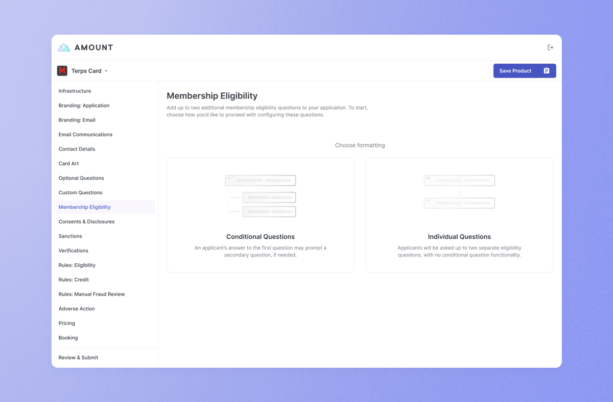
Though the module still needed to accomodate both use cases, it did not need to do so all in one environment. Aiming for a more direct approach, it was realized that we could have users directly choose how they wanted to approach their eligibility question layouts, improving user understanding and clarifying interactions as a whole.
Question Layout
Instead of dropping users into a module with a multitude of complex interactions, the revised design has them choose at the start how they would like to add eligibility questions, with visual cues indicating how the chosen layout would function. At any time, users can change their layout by restarting the module.
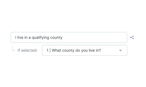
Conditional Questions
I added increased affordances to allow users to add, edit, and link their questions as needed. Users can freely add conditionals to the module and link them after building up their questions, or they can take the original approach of tethering a conditional directly to an answer.
Individual Questions
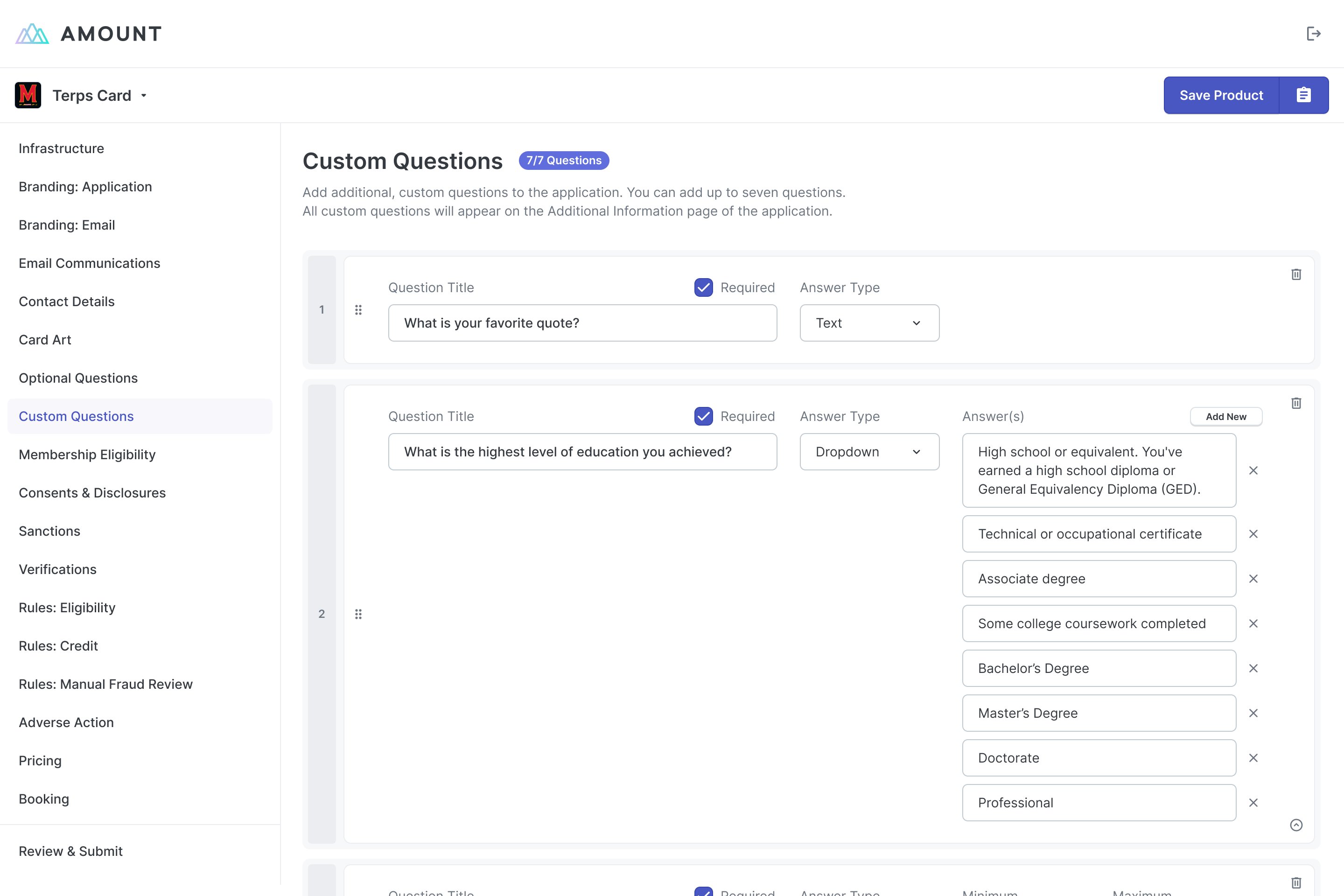
Building on previously established patterns from modules like Custom Questions, the individual question layout allows users the option of up to two separate questions individually.
Product Bookend
A centralized dashboard for configuration management.
Product Controls
Users needed to be able to view their products at-a-glance in a simplified dashboard environment.
Product Statuses
The dashboard also functions as an at-a-glance look at the state of their current product configurations, allowing partners to gain insight into their product implementation.
Facilitating new product creation
Generating a new product is intentionally simple, and users are prompted to do as such from their dashboard. Once created, the product is added to their dashboard and is available for editing.
Progressive onboarding
To avoid a dragging onboarding experience, the product loads "bite-sized" tips and directions about the admin portal, allowing users to freely jump in, explore, and set to building their product without being impeded.
Product Bookend
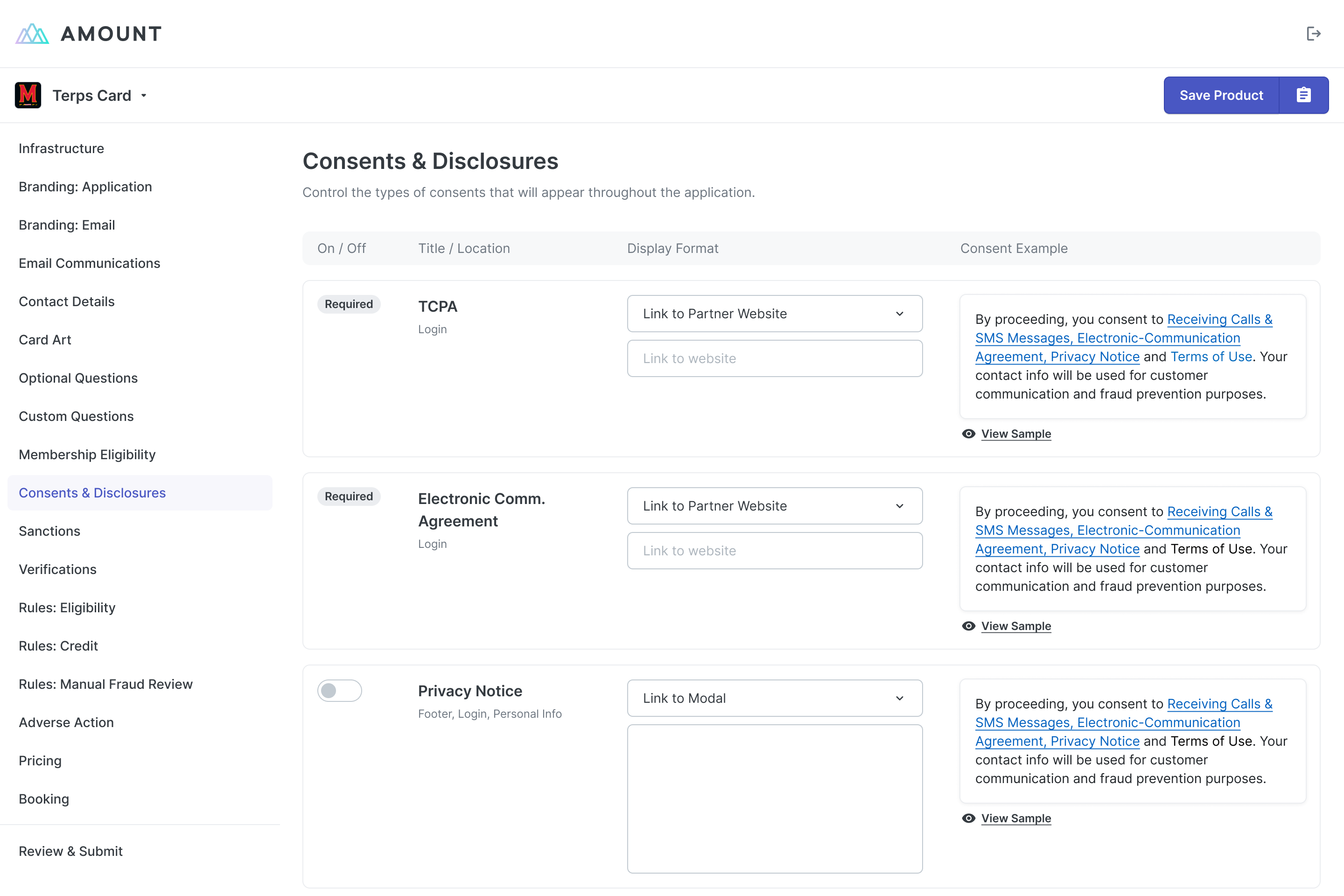
Designing a clear-cut review and submission process.
A crucial part of the Admin Portal was the review process prior to submitting configurations that had been entered. For the MVP, the submission process was treated as a final act, with no post-submission editing offered. If edits were needed, partners would need to contact Amount directly.
Pre-Submission
I needed to create a focused configuration summary process that allowed users to at-a-glance view their configurations, scaling from a granular to a broadened level.
Post-Submission
Our post-submission product handling approach had to be accommodating and useful, with the option to contact Amount for edit requests directly baked in.
Simplistic UI design to reduce cognitive overload.
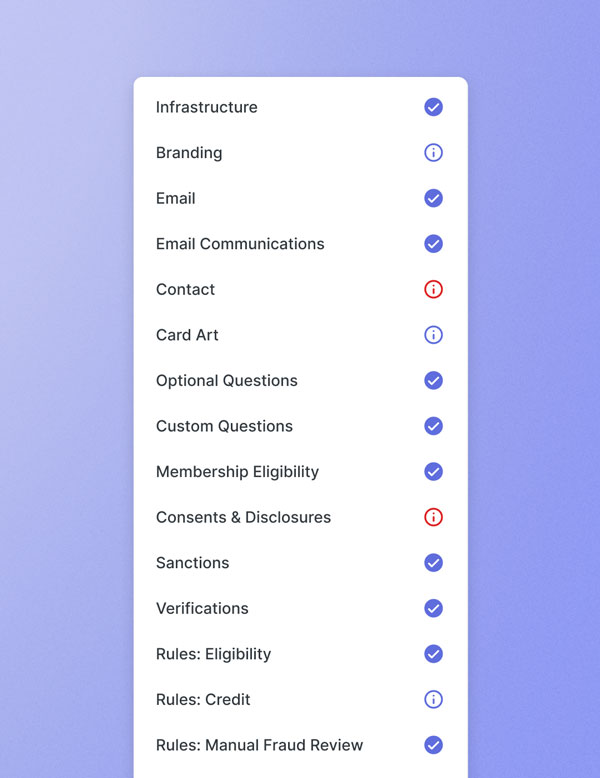
Module configurations are condensed into collapsed sections correlating to the navigation on the left. At a broad level, users can utilize the review page to get a glance of what modules are complete or incomplete prior to submitting.
Facilitating business-to-client communications within the post-submission environment.
After submitting configurations, partners can view the status of their submitted product through the main dashboard and can access the previous summary of their configurations for review.
Enhancing our UX to improve partner understanding
My final design consideration focused on evolving the experience of the portal and filling the potential gaps between partner understanding and module expectations through easy-to-access design resources.
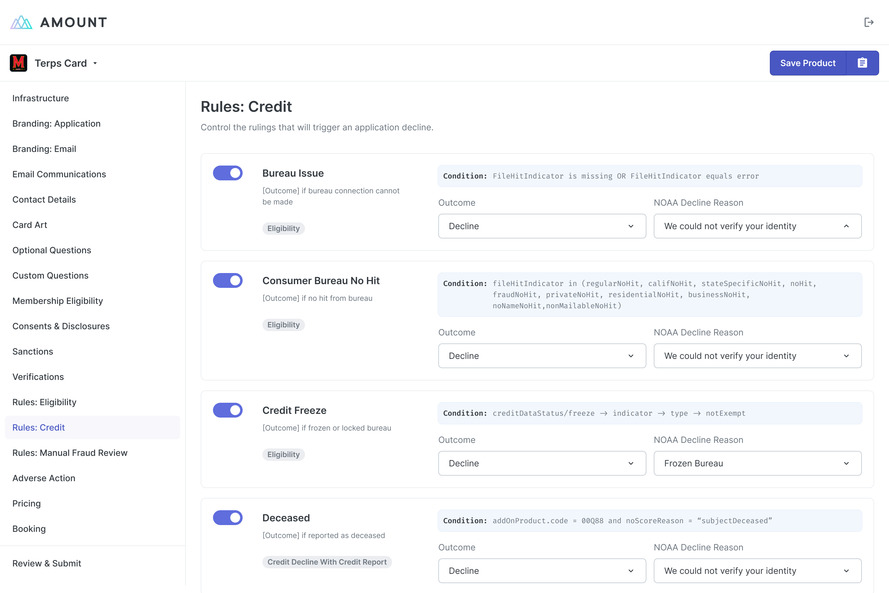
Evolving product navigation to offer updated module completion states at a glance.
There was a noticeable lack of progress indication whilst working on modules, requiring users to repeatedly jump into and out of their review page in order to access and process information. To bridge this UX gap, I redesigned the product navigation to add a secondary purpose in showing the status of the module itself.
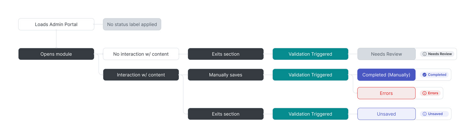
I worked with our developers to implement "fallback" validations tethered to specific user interaction, which allowed the navigation to preserve entered configurations and relay them to users as an "Unsaved" state. With this change, the navigation became akin to a running "checklist" users could reference as they navigated throughout the product, improving insight and reducing the need to remember the completion status of each module individually.
Utilizing conversational AI to direct users towards insightful documentation for their product.
Though the majority of partners had experience in the configurations of their product, we wanted to implement a way for users to easily access documentation and resources that Amount had previously set up for partners to utilize.
The chatbot was built using Google's Dialogflow API, which meant that the UI styling needed to follow pre-established guidelines. I modeled the UI around the Admin Portal style, and provided examples of hover and link states to developers for their build.
Though the documentation resources currently exist outside of the Admin Portal, a dedicated "Documentation" environment was planned to be added during Q1 of 2024.
Post-Launch Metrics
Because the Admin Portal was set to be launched to a relatively niche set of users (at first), the metrics set to track were meant to reflect Amount's first step towards a full-scale SaaS product.
System Performance
Monitoring system downtime as well as overall system performance was crucial, as the Admin Portal was built on codebases that were slightly dated.
User Satisfaction
Through direct communication with partners, monitor overall satisfaction with the product and pinpoint areas of improvement from both a UX and technology perspective.
Error Rates
As the MVP continued to be used, monitor errors within modules of the portal itself in order to measure success and performance of the product.
Time to Live
Specific focus was meant to be put on tracking the overall time between configuration submission and implementation, and targeting future areas of improvement as Amount moved towards a full-scale SaaS product.
Revenue Impact
Though not directly design-related, the push towards a SaaS business model naturally intertwined itself with financial monitoring and the overall impact the Admin Portal could have on Amount's revenue streams.
Results
The MVP of the Admin Portal launched shortly before the end of Q4 2023 for use internally. Prior to the launch, I worked closely with developers in daily QA sessions to walk through existing module builds, discuss any limitations that may have arisen, and discuss any compromises that may have been needed between the envisioned design and MVP possibilities.
I also set up plans for moderated testing with our external partners prior to the Version 1.0 of the Admin Portal. Though I departed Amount before this could be accomplished, I am confident that the existing MVP of the portal will continue to be expanded and improved upon with the design artifacts and guidelines I was fortunate enough to have set up.
LIAM MADIGAN
CHICAGO, IL
© 2025
LMADIGANDESIGN@GMAIL.COM