ABLO
Ablo prides itself in their mission: Design for all. To emphasize this mission, they envisioned intertwining the power of generative AI with the exclusive fashion industry, allowing users to bring their creativity to life through custom fashion garments.
In this six-week design sprint, Brightscout partnered with Ablo to create a bold brand combined with a seamless design portal, allowing Ablo to hit the ground running to partner with top fashion brands and change the way the world approaches design.
BRAND
Giving the boldness of Ablo's mission an identity to match with a brand that pulls no punches.
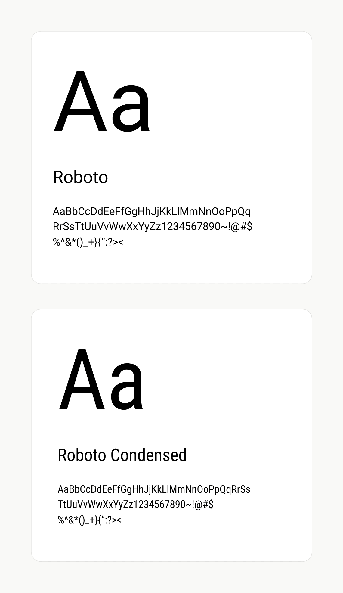
A simplified core color palette solidifies Ablo as a modern and fresh take on fashion design, while emphasizing brand recognition and visual appeal.

DESIGN PROCESS
Unifying product ideation through collaborative UX workshops
I hosted two UX workshops with the Ablo team aimed at clarifying and solidifying the core experience of their envisioned product. Through repeated ideation and grouping exercises, the flow of the product began to naturally build itself.
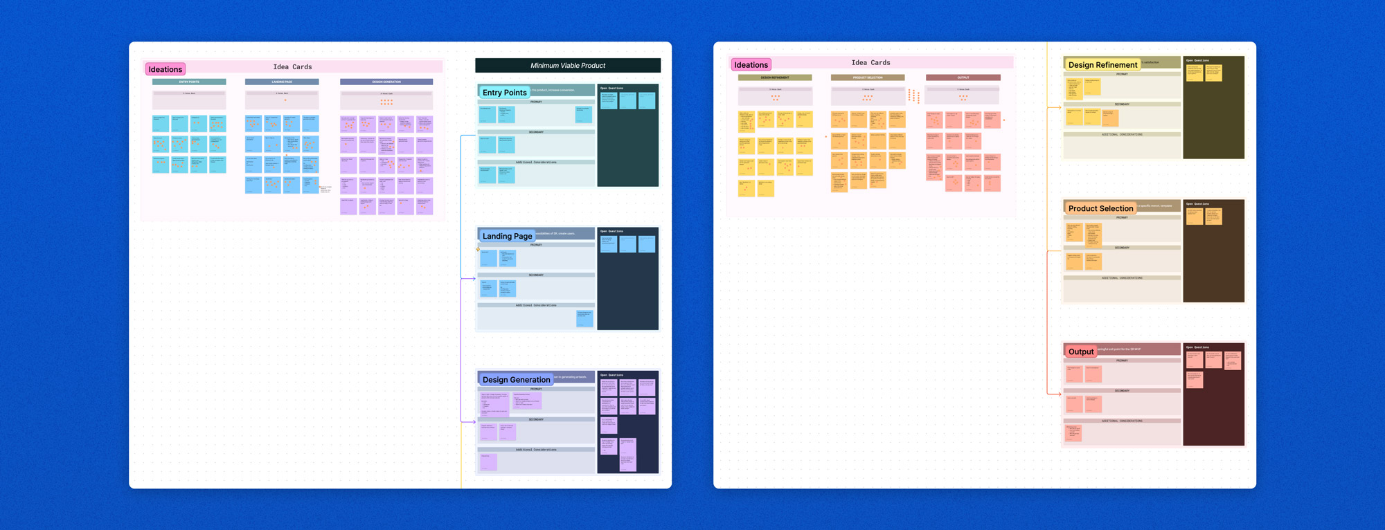
We also performed rapid user interviews to understand how best to tailor our experience. Using the information gained, we defined three core sections of the Ablo product experience. Once defined, user flows were created and collected in a digital booklet, providing tangible design artifacts for the team at Ablo.
Selection
How might we create an efficient and informative process of selecting an item to design on?
Generation
How might we utilize the capabilities of AI to support boundless creativity and creation?
Output
How might we create artifacts both intangible and tangible- allowing users to bookmark their experience however they choose?
SOLUTION
A bold yet inviting approach to fashion design
Starting from the home screen, users can easily select a product and launch straight into the design generation process.
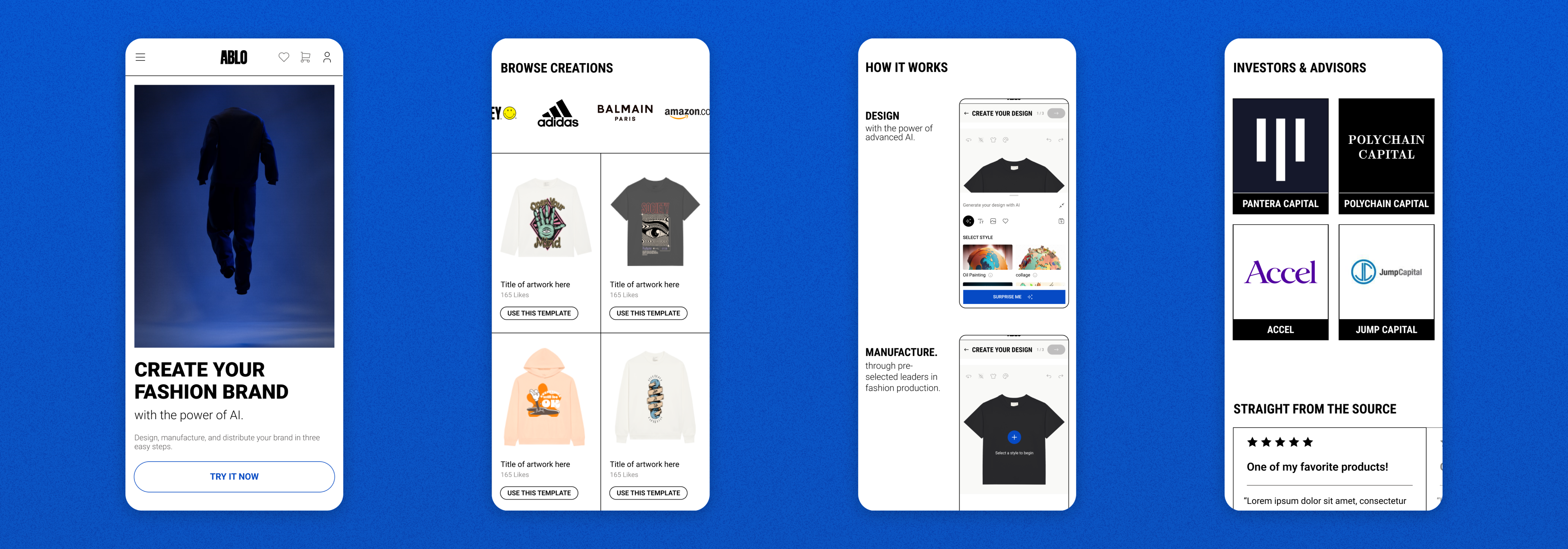
The Ablo homepage ushers users into the generation portal, while showcasing existing designs and instructions to ensure understanding.
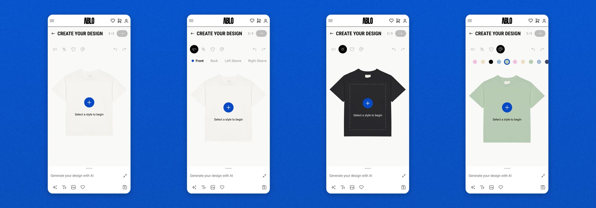
Users can freely control the details of their product, adjusting the coloring, view, and design area to their exact liking.
Design generation is divided into three sub-stages: style, mood, and subject. At each stage, a streamlined product experience allows users to quickly dive in and let their creativity fluorish, accomodating the endless possibilities of ideas.
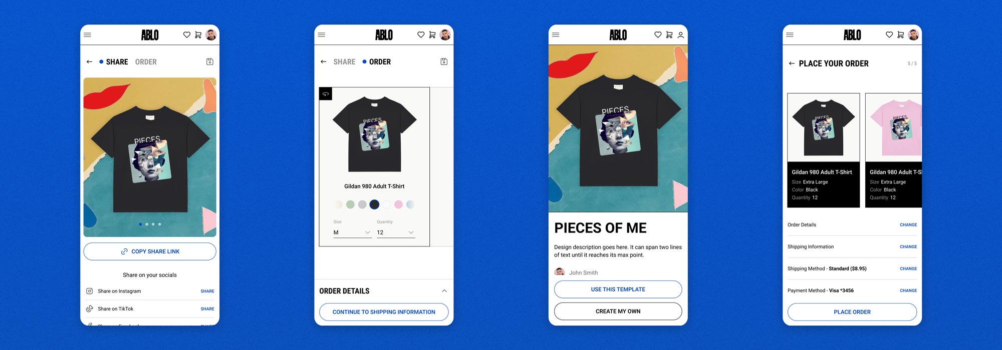
Users can share their creations as templates and social links, or order it themselves to wear and flaunt.
ITERATIVE DESIGN
Validating design decisions through user testing.
Designs were tested through unmoderated sessions, with two groups of participants: one knowledgeable in fashion design, and another group outside the world of fashion. Though majority positive, there were key points of potential improvement:
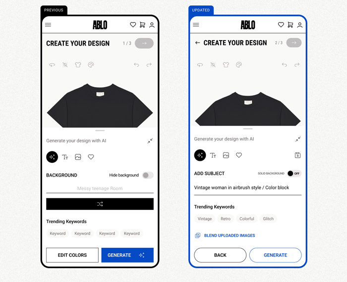
Clarifying design generation
Participants felt that the experience was trying to balance too many things in one consolidated group, leading to a lack of hierarchy and clarity in how to proceed.
Utilizing collaborative working sessions, we tweaked the UI to have a more solidified hierarchy, focusing more on freeform input supported by trending keywords.
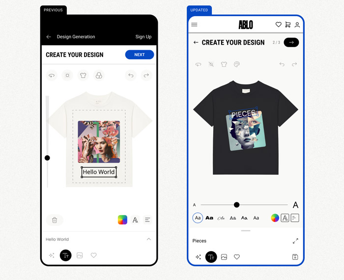
Tightening design editing
Feedback from participants noted that the latter half of the design generator felt clunky and hard-to-use. UI elements were spaced out oddly, causing the interaction design of the product to suffer.
Utilizing feedback as well as thumb mapping and interaction points, we restructured the UI to provide a clearer hierarchy to the design generator, allowing users to control their designs in a manner that felt intuitive and seamless.
PRODUCT EXPANSION
Expanding product offerings towards a B2C environment
In addition to the initial B2B experience, Ablo expressed a desire to connect directly to consumers by expanding design generation out towards an individual creation process. Though much of the core product remained the same, several features for individual creators were designed out and packaged along with the final product:
Listing a design
Once individual creators design their product, they have the opportunity to list it within the Ablo marketplace. Users have control over the pricing, buying options, and more.
Reviewing ordered products
Collecting and hosting feedback was a crucial part to the B2C experience, especially as users bought and experienced the tangible products of the brand. Feedback collection is simple and concise, allowing users to easily contribute their thoughts.
Results + Learnings
MVP Mobile Product
Ablo launched with a mobile-focused MVP in July of 2023, to positive investor and user feedback. Since then, Ablo has further developed its product offerings, being considered one of the best AI fashion tools on the market. They've also expanded their partnerships, including a recent collection with Crocs.
Thoughtful AI Integration
As a core component of the product, strategically utilizing the generative aspect of AI within the user journey became important. By balancing the power of AI and implementing it through intentional touchpoints, we maintained a critical balance between AI and human personas.
B2B to B2C
Designing a product that could interact seamlessly with both business models was particularly challenging. At every step of the way, we utilized feedback and iterative design to solidify our designs so that Ablo could seamlessly appeal to both markets as needed.
Conclusion
By the end of the project, Ablo had a fully designed experience for both their B2B and B2C initiatives, allowing them to move forward with potential investors as well as custom fashion brands interested in partnering with them to create exclusive experiences for their customers.
LIAM MADIGAN
CHICAGO, IL
© 2025
LMADIGANDESIGN@GMAIL.COM


