Envisioning life on new worlds with education and collaboration.
YOUR FORBES
In response to the ever-evolving digital landscape that exists nowadays, Forbes tasked us to design the future of their online experience with the goal of bringing new users to the site, as well as increasing retention of existing users.
DETAILS
Team Lead / UX + UI Designer
12 Weeks, Spring 2020
4 Designers, 2 3D Designers, 3 Developers
PURPOSE |
In the digital age we live in, customers are used to having relevant news at their fingertips.
As kids, we look to the stars and space in wonder and amazement, wondering what life could be like on other planets. As a society, we are driven to explore and push the boundaries of our scientific and technological limits, constantly working to expand the human race beyond Earth and into the stars.
As we consume more of our planet's resources and learn more about our universe, the idea of transforming other planetary bodies to support life becomes not only imperative, but achievable. Known as terraforming, this process has been discussed more and more in recent years as humanity's scientific capabilities continue to steadily advance.
KR33-8 was an immersive physical installation created to educate and inspire visitors about the ever-growing possibilities of terraforming and creating life on other planets. Originally to be exhibited at the Imagine RIT festival in May of 2020, our team was forced to pivot and adapt to the challenges presented with the rise of the COVID-19 pandemic. Of the nine team members, I was the team lead as well as a UX / UI designer.
Educating visitors through imagination.
Fascinated by the rapid evolution of technology in todays world, we took inspiration from the efforts of companies like SpaceX and NASA to place humanity on new planets. The KR33-8 team wants to strike the balance between science and fiction, exploring the possibilities of terraforming through an imaginative yet educational experience!
02 ─ THE EXHIBIT
Surveying to explore how users are currently consuming their news.
Inviting visitors to join the KR33-8 crew, and utilizing collaborative and educational minigames to allow them to create life on new planets.
Inspired by the unification of humanity expanding our lives to the stars, we made collaboration a core part of our exhibit. Paired in groups of three, visitors would take on the role of scientists and explorers of the KR33-8 crew. Challenged to complete three consecutive minigames based on the terraforming process, the group would be able to see their planet come to life right before their eyes, both digitally and physically.
Taking an ordinary classroom and turning it into an immersive spaceship.
KR33-8 presented a unique challenge that we had never faced before while in college: experiential design. We knew that, due to the sci-fi and imaginative nature of our exhibit, we wanted the actual space users would be experiencing it to be as immserive as possible. To do this, we spent a great deal of time analyzing the classroom KR33-8 would be exhibited in as well as the experiences and interactions our visitors would have during their time with us.
We mapped out the movement of our visitors throughout our room, envisioning a clockwise movement for each visitor. Visitors could learn about the terraforming process on their left directly after walking in, followed by the main experience of our exhibit, and finally would get to enjoy numerous supporting interactions as well as get the chance the grab some free swag!
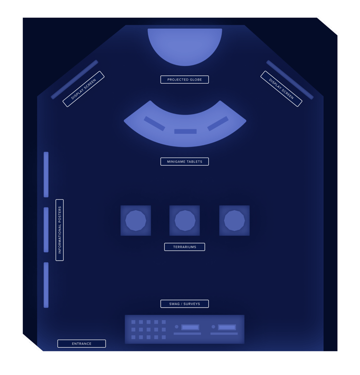
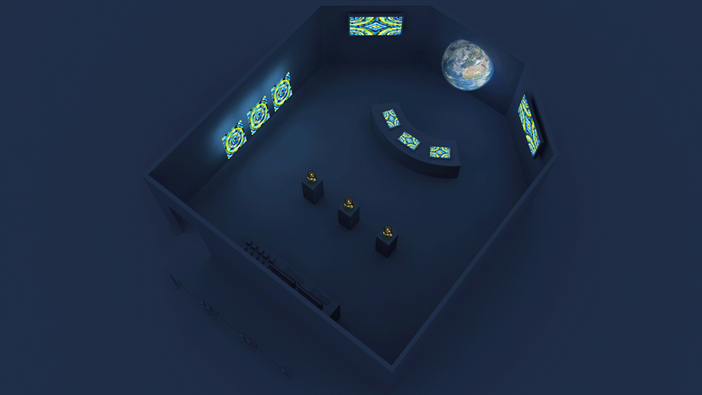
EXHIBIT STEPS
TIER ONE - PERSONALIZATION EFFORTS
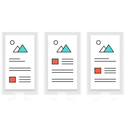
Learn - Engaging Infographics
Through a series of animated infographics based on the terraforming steps, users would learn a little about the science behind the minigames, as well as the minigames they would soon be playing.
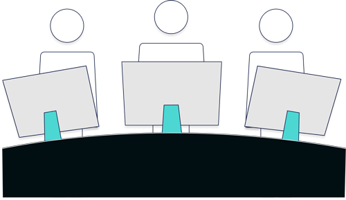
Play - Collaborative Gameplay
Paired in groups of three, each visitor would be assigned to a tablet and, as a group, they would play all three terraforming minigames sequentially, learning about how each game’s outcome would impact the planet they’re building!
Create - The Planet Experience
If each game was successfully completed as a group, visitors would get to watch their planet come to life through projection mapping, as well as view a short cinematic of their planet surface on the tablets.
THE GAMES
TIER ONE - PERSONALIZATION EFFORTS
Creating our minigames
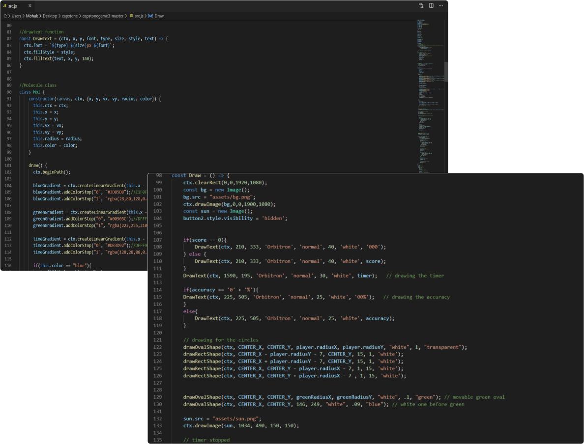
For our minigames, we used Vanilla JavaScript along with Canvas and HTML/CSS to make the game functional. We would export Figma files that our Designers created and manually draw them onto the game canvas.
The assets were exported to accomodate the visual design whereas some were rendered with code including time, score texts and similar elements. We also used JavaScript’s timing events and a bit of math to make the animations and interactions work. Each developer worked on one of the three games, with consistency kept through communication.
MINIGAME 01
Finding the perfect planet
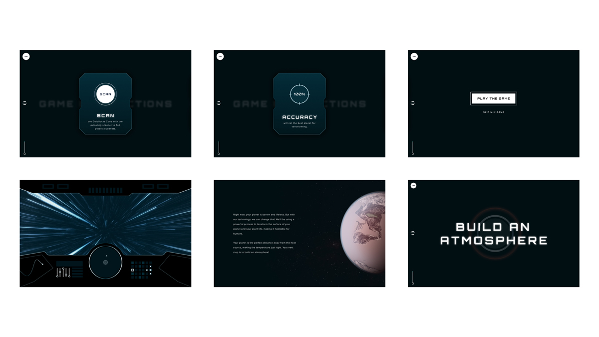
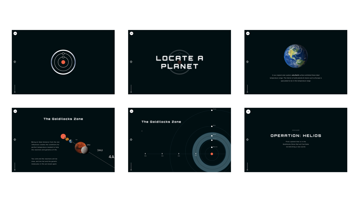
Our first minigame focuses on finding a planet that is the right distance away from a heat source, within an area called “The Goldilocks Zone”. Users are tasked with stopping a pulsating circle within the zone as many times as they can within the timeframe, with the game difficulty increasing each time the user stops the pulsating circle.
MINIGAME 02
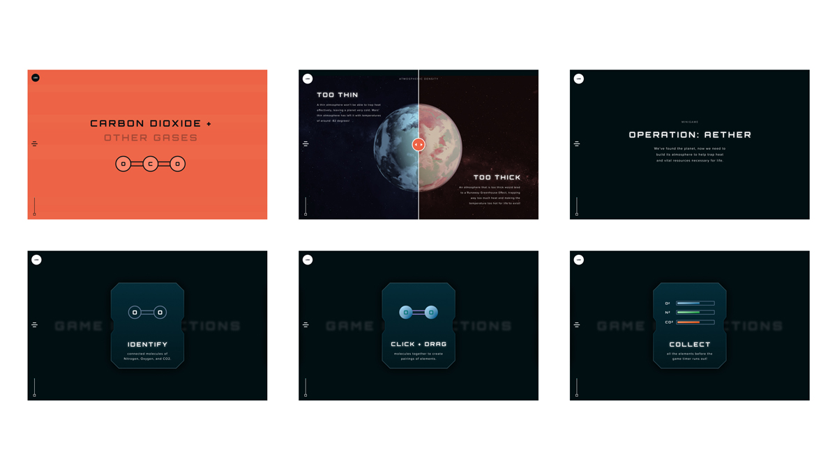
Building an atmosphere
The second minigame focuses on establishing a planet’s atmosphere to trap heat, shield from harmful radiation, and provide chemicals for life. An array of elements are presented to users, and they will have to create atomic pairings by combining the necessary elements.
MINIGAME 03
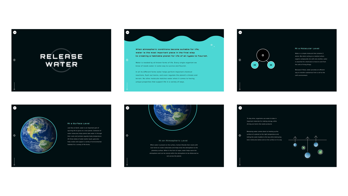
Find and release water
Just like on Earth, water will be essential in spurring life to grow on a new planet. Our third minigame focuses on making sure water on the planet isn't toxic to life. Users will be tasked with removing the toxic bubbles from the game, while the speed and amount of the bubbles increases, ramping up the difficulty and challenge!
TANGIBLE EXPERIENCE
TIER ONE - PERSONALIZATION EFFORTS
The Planet Experience
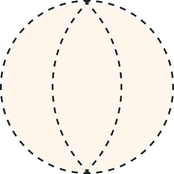
Being the largest feature of our exhibit, we carefully planned how we would build our massive planet. Starting with a base of a 6 foot beach ball, we would cover it with sewed projector fabric, and then suspend it in front of the visitors from the ceiling, allowing for us to project our 3D imagery onto it with MadMapper and an epson projector.
Epson Projector + MadMapper

Beach ball + projection cloth
Although we initially planned to build our own planet, we instead opted to leverage an existing (and much less expensive) option, a massive beach ball! Our set designers would effectively sew projection fabric around the ball, which would then be suspended from the ceiling of our classroom.
Watching your planet grow
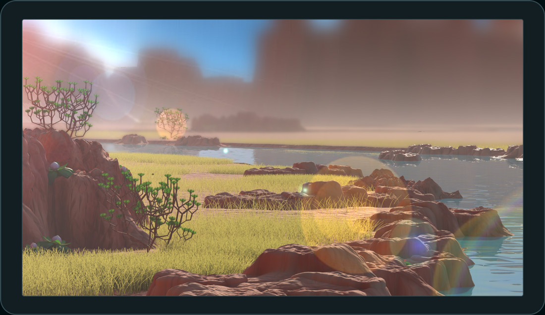
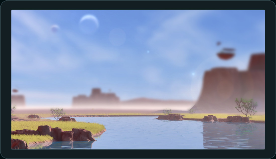
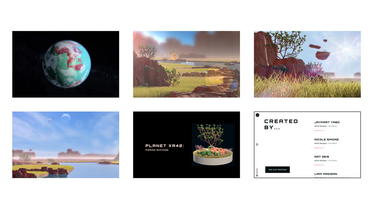
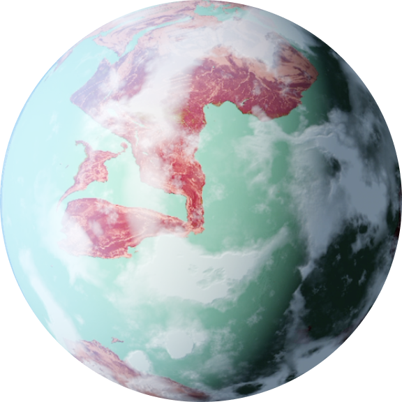
After each minigame, a user will get to view the impact that the step and subsequent minigame have had on their planet. Users will get to enjoy beautiful visuals showing them the finding of a planet as well as the building of an atmosphere. After playing the third minigame, a user will see their fully completed planet from both a space and surface level view.
From Space to Surface
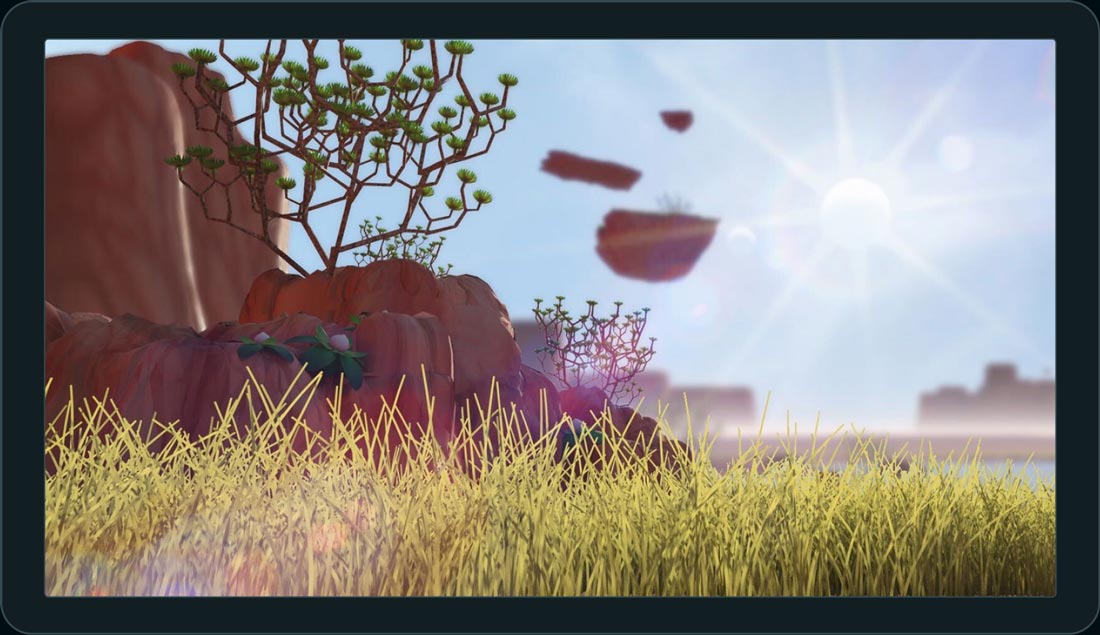
After completing the third and final minigame, users will be able to view their fully created planet from a surface-level, taking in the beautiful and breathtaking imagery of brand new life on their now habitable planet.
Life on another planet
To further allow users to learn about just why the the life on their planet is the way it is, users would also view a small vignette of their planet with numerous different plant life, getting see the similarities and differences that their planet has compared to our own!
PERIPHERAL INTERACTIONS
TIER ONE - PERSONALIZATION EFFORTS
AR Portholes
Scattered around our exhibit would be three spaceship portholes for visitors to explore. Although the portholes will be "closed" in real life, by using tablets and AR technology visitors would be able to see the porthole open on their screens and view small 3D scenes of other areas of the "space ship".
Terrarium Podiums
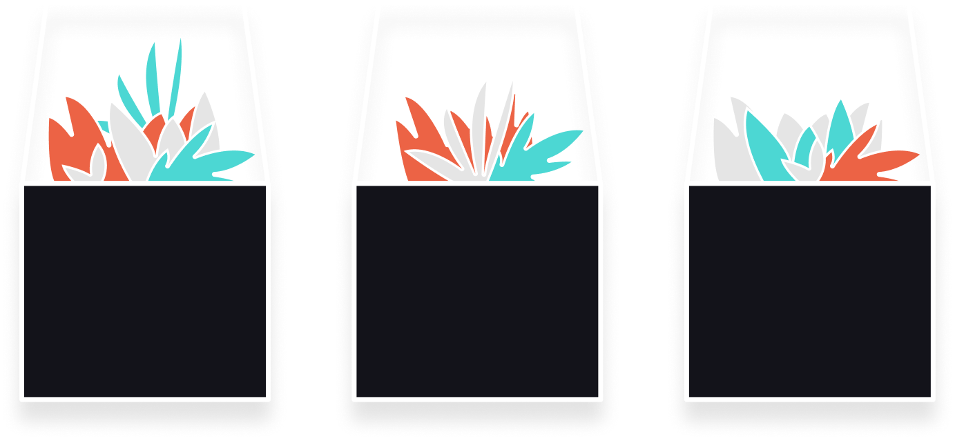
To further support the focus on nature and the growth of life in our exhibit, we would have three terrarium stations showing "terrariums" made out of spray painted fake plants for visitors to explore. These terrariums further explore the concept of what future life could look like on an alien planet.
Animated graphics and imagery
To emulate the sci-fi elements of a spaceship, we would be creating short motion pieces and background experiences to help entertain and enthrall visitors. Additionally, we planned to utilize LED light strips and coding to have the room "react" to a successful or failed planet creation through blinking, colored lightshows.

Immersive dialogue
Every visitor would be treated as a member of the KR33-8 crew, allowing them to fully immerse themselves into the exhibit and goal of the crew: to create life on new planets!







04 ─ THE PIVOT
Surveying to explore how users are currently consuming their news.
And then COVID hit. Hard.
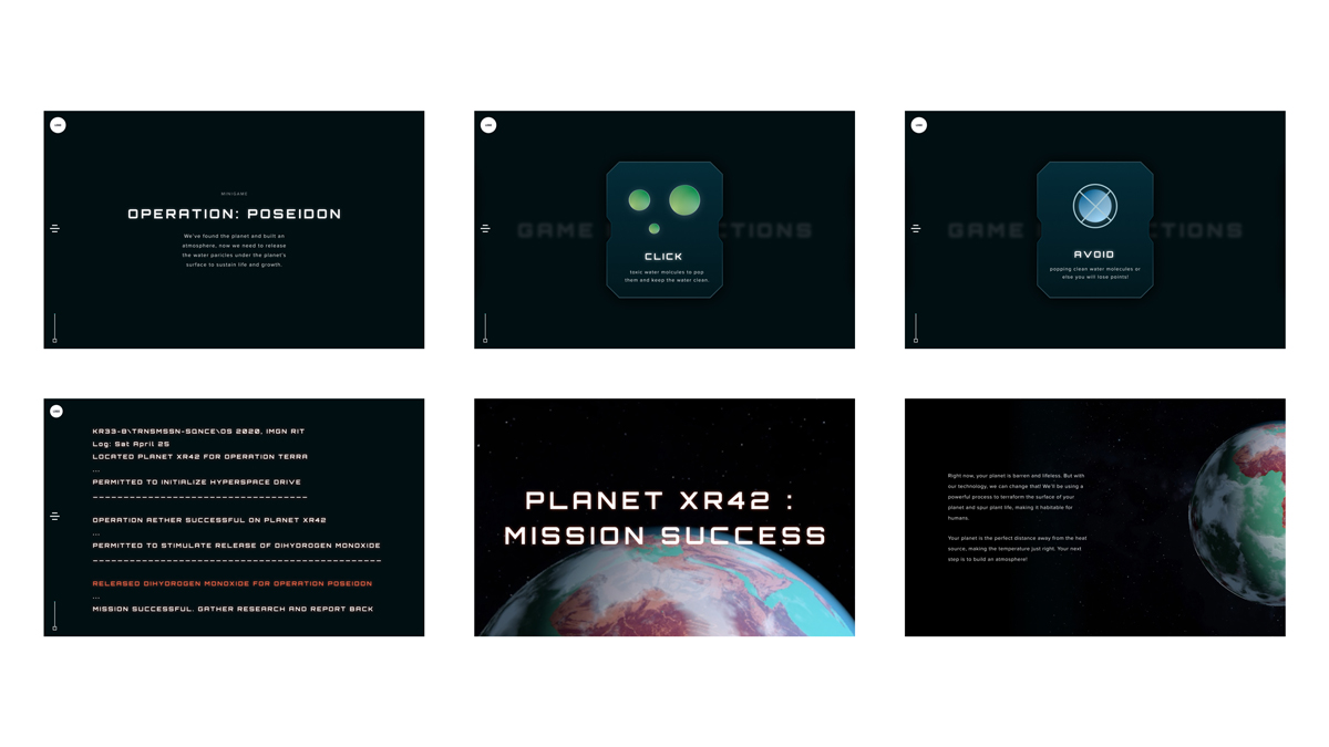
Unfortunately, in the midst of our project the world was hit by a much more pressing issue: COVID-19. As the world was quickly forced to transition into a purely digital space, so to was our capstone project. Within the span of a couple weeks we had to completely pivot KR33-8 into a fully digital experience. To do this, we pulled the main focus points of our original experience and tried to transfer them into an entirely new experience.

An interactive, educational scrolling experience utilizing Webflow.
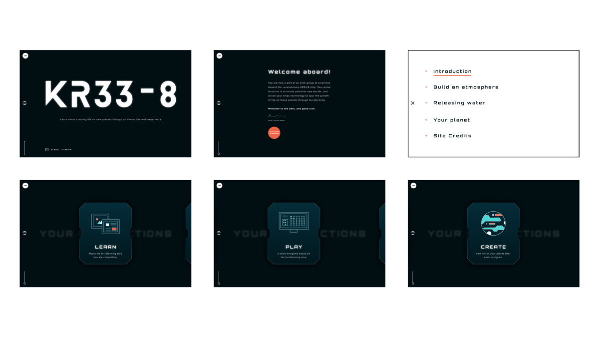
The sudden changes caused due to COVID forced us to reapproach how we would build out our experience. Eventually, we decided to utilize the in-depth capabilities provided by Webflow to build out our scrolling one-pager. With this established, we translated the in-person experiences of our initial idea to three core principles that would guide the one-pager experience: Learn, Play, Create.
Learn
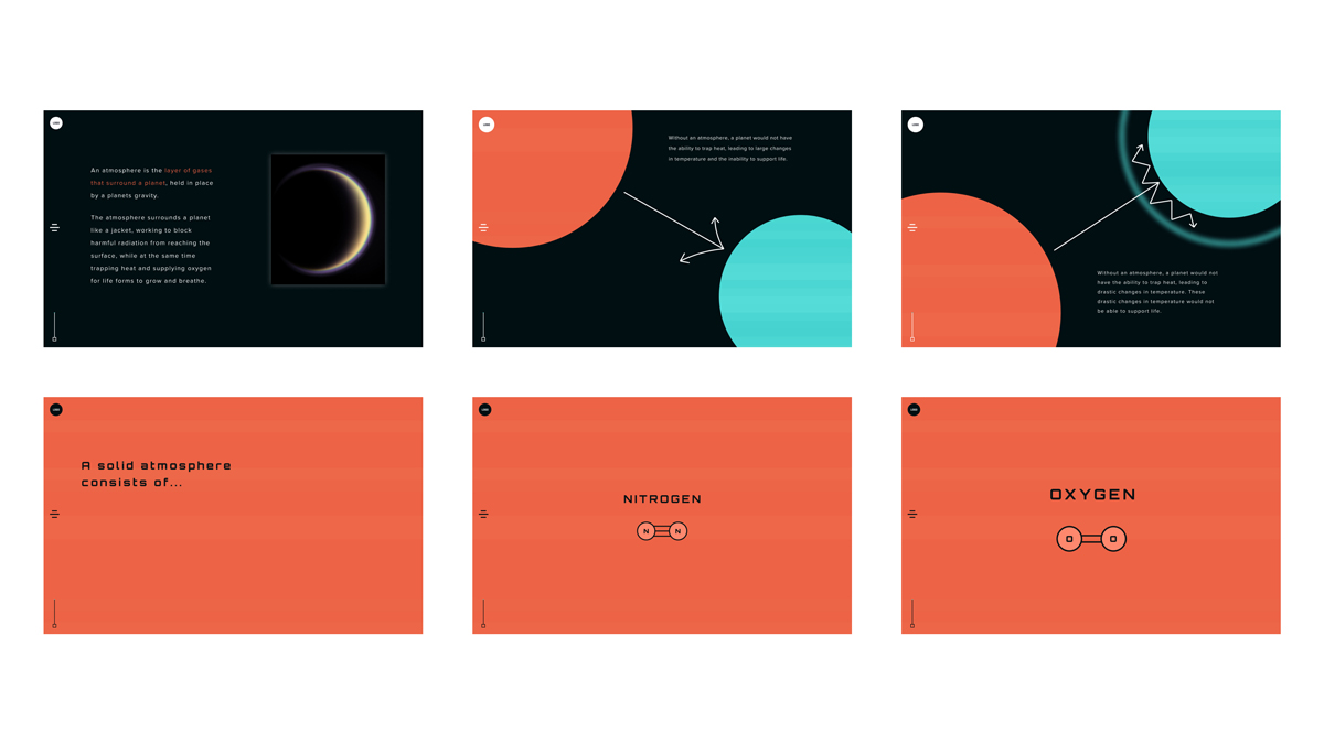
Our one-pager would primarily be comprosed of an engaging and interactive experience that leverages scroll-based animations to educate users around the "steps" of terraforming.
Play
Following each educational segment, users would be prompted to play the corresponding minigame. Unlike in our initial exhibit, this game would instead be optional, so as not to awkwardly disrupt the continuous aspect of the experience.
Create
In lieu of a large-scale projected planet, our users would instead be shown several animated segments showing the progress of their planet following each minigame.
Treating every user like a new member of the crew
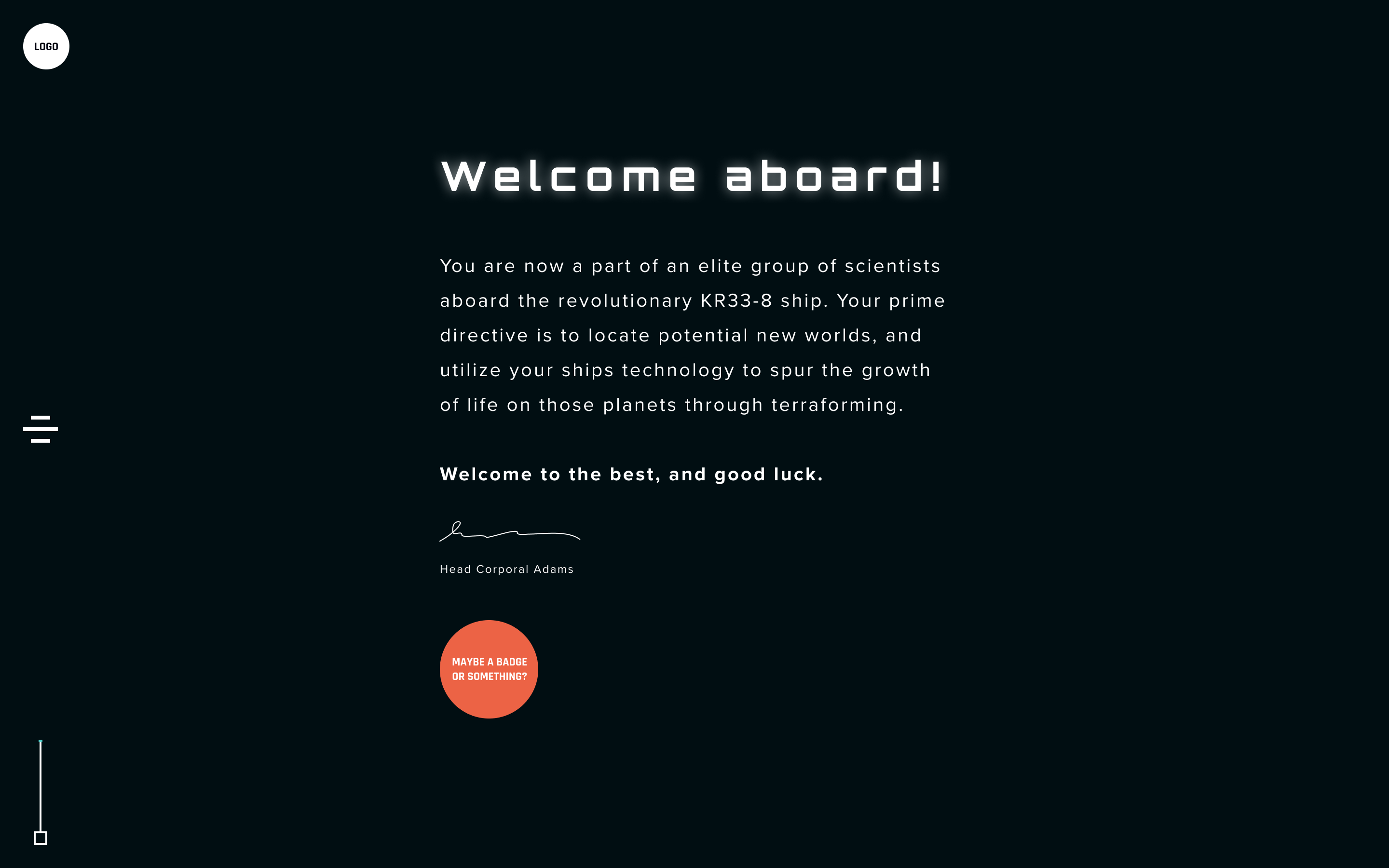
In our initial exhibit plan, we had in-depth plans to treat our visitors as members of the KR33-8 crew, introducing them to and guiding them through our exhibit in an immersive way using 1-on-1 interactions. To replicate this in our digital experience, we took measures to make sure the copy in our experience still treated each user as a team member.
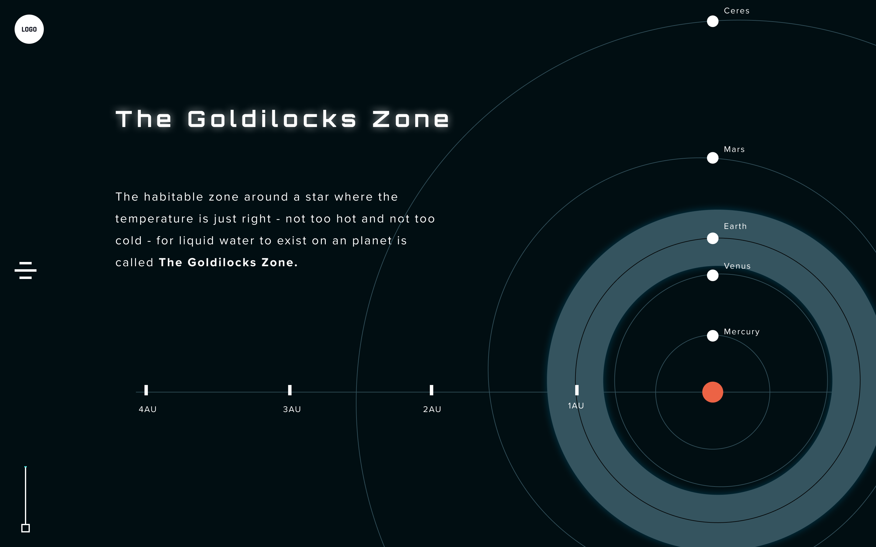
Simplified information delivery
Science can be a daunting, complex thing to wrap your head around, especially within something as advanced as terraforming. To make sure our users could easily understand the terraforming process, we simplified our information delivery into easily digestible sections.
Immersive Scrolling
To support the educational scrolling sections of our experience, we took into careful consideration the easy pleasure that can be provided to users through dynamic animations and movements, rewarding a user for doing something as simple as scrolling and reading.
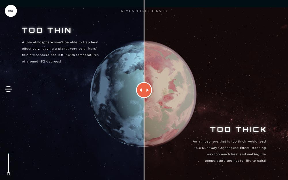
Bite-sized interactions
To further diversify and immerse a users attention while scrolling, we incorporated custom-coded simple interactions that a user can explore, allowing them small moments of delight while still maintaining the educational aspect of the learning sections.
VISUALS
TIER ONE - PERSONALIZATION EFFORTS
05 ─ IN CONCLUSION
Surveying to explore how users are currently consuming their news.
Unfortunately, due to the ever-changing world landscape we were forced to cut the digital version of this project off prematurely.
Although our vision was able to be successfully translated into a digital landscape, the rise of COVID gave way to understandable real-life concerns by the members of the KR33-8 crew. Due to this, we were unable to complete the full building of our project in Webflow. However, the growth that KR33-8 offered both in it's original vision as well as the pivot were tremendous. Although we did not get to "KR33-8" our exhibit in the original way we had planned, we gained the opportunity to grow as a team as well as designers, navigating unprecedented obstacles and turning them into unique learning opportunities.
PERSONAL LEARNINGS
TIER ONE - PERSONALIZATION EFFORTS
Designing for both digital and physical spaces
It was easy to fall into a comfortability throughout college of knowing a lot about the types of spaces I was designing for: phones, desktops, tablets, etc. However, the opportunity to design for an exhibit forced me as a designer to consider entirely new details. Things like where our experiences would be placed and how to map out the progression of our visitors through our experience presented unique yet worthwhile challenges. In the future, I hope to further design experiences that merge both digital and physical spaces!
Raising concerns before they snowball
As the team lead, it was extremely crucial to me to foster a communicative environment that allowed for concerns to be heard and dealt with as soon as they appear. To do this, I made sure to prelude each team meeting with a specific call to action for anyone's concerns to be voiced and documented, allowing us to specifically deal with it as a team as early as possible. From a digital standpoint, I leveraged daily slack based reminders prompting my team to share what they would be working on, as well as if they had anything that was causing them trouble.
Embracing the pivot
To be entirely honest, the sudden influx of COVID changes sucked. The changes that COVID caused on our project sucked. Having to entirely drop the physical portion of our exhibit, well, you get the rest. However, I was able to learn an important lesson from the changes we were forced to make: embracing the fact that not everything will always go as planned. The pivot itself is often one of the most beneficial learning experiences, because it allows you to further grow while forcing you to keep your head up and become flexible, adapative, and overall a stronger designer.
$790
DONATED TOWARDS COVID RELIEF
In the digital age we live in, customers are used to having relevant news at their fingertips.
Because of the reduction of needed funds, we instead made a donation to the COVID-19 solidarity response fund.
We wanted to leave our project off with a positive impact on the world itself, especially as times continued to get tougher. We reached out to each one of our donors individually, expressing our gratitude and offering them the option of recieving a full refund, or putting their donation into a pool that would be donated towards COVID relief!
MEET THE CREW
TIER ONE - PERSONALIZATION EFFORTS
Liam Madigan
Team Lead, UX / UI Designer
Jaymart Yabo
UX / UI Designer, 3D Designer
Nicole Simone
UX / UI Designer, Set Design
Nat Deis
UX / UI Designer, Set Designer
Sophia Zappata
3D Designer
Gan Lin
3D Designer
Irvin Do
Developer
Mohak Padukone
Developer
Stanley Louie
Developer
A special thank you to...
Both Adam Smith and Carlos Castellanos for their continued guidance and support throughout this entire project. Even in times of uncertainty, we always had your support and advice to lean on and consider. We would not have been able to blast off without you!
The New Media Design as well as New Media Devlopement BFA programs, for allowing us to spend the past four years developing our skills and abilities, and giving us a strong platform to start from when leaving college and entering the real world.
LIAM MADIGAN
CHICAGO, IL
© 2025
LMADIGANDESIGN@GMAIL.COM
